Teal Climate
Designing an intuitive, efficient, and secure SaaS platform for B2B institutional/corporate greenhouse gas accounting and reporting, which minimizes user effort in data input and navigation while ensuring data security.
Timeline
5 weeks
My Role
UI/UX Designer (Project lead)
Tools
Figma, Figjam, Canva
Process
Discover, Define, Ideate, Prototype, Test and Iterate.
Overview
Teal Climate is a non-profit organization dedicated to advancing technological solutions for agricultural, environmental, and landscape sustainability. The primary objective was to develop a Software as a Service (SaaS) platform tailored for institutions, companies, and individuals to conduct greenhouse gas accounting and gain insights into their carbon footprint.
As the Project Lead and UI/UX designer, I collaborated with two other designers to delve into the complexities of greenhouse gas accounting and redesign their dashboard for visualizing greenhouse gas data.
View Prototype

The Challenge
Designing an intuitive, efficient, and secure SaaS platform for B2B institutional/corporate greenhouse gas accounting and reporting, which minimizes user effort in data input and navigation while ensuring data security.
Solution
Through design thinking methodology, redesign the Saas platform to minimize the number of data input from users and visually represent complex data in dashboard.
Project Plan
Before delving into the project, as a Project lead I proactively engaged with my fellow designers to establish a comprehensive project plan and timeline to present to the client. This outlined what files would be shared, the research methodologies to be employed, allocated necessary hours, and defined the division of work.
By ensuring that everyone was kept informed and aware of their upcoming tasks and deadlines, this process fostered efficiency for both the client and the design team. It also provided a valuable reference point throughout the project lifecycle.

01. Discover
Secondary Research
The User
From our initial client meeting we established our user to be professionals within B2B institutional and corporate settings involved in greenhouse gas accounting and reporting, such as sustainability managers, ESG analyst, environmental consultants, or finance personnel.
There was no other preliminary research provided, prompting our initial objective to understand the problem and user needs. Additionally, the client highlighted existing design constraints such as minimizing data input and the need for a streamlined dashboard for showcasing complex data.
With this insight, we started our research by doing a heuristic analysis of the existing SaaS platform. This involved identifying prevalent usability issues and finding areas of improvement. For this section, I tackled the dashboard section of the platform whereas the other designers did their analysis for the Profile and Carbon Calculation section.

With deeper insights into the existing issues, I embarked on researching industry leaders such as Persefoni to assess the user experience strengths and weaknesses of their SaaS platform and uncover actionable insights. Given that their platform was exclusively accessible to enterprise users, I turned to online resources such as YouTube demo videos, images, and articles to analyze its functionalities.
Persefoni is a software-as-a-service (SaaS) platform designed to help organizations manage their carbon footprint and navigate the complexities of climate-related data reporting and management. Positioned primarily for enterprises and financial institutions, Persefoni combines climate and financial data to provide insights, reporting capabilities, and compliance management tools that align with global standards for greenhouse gas (GHG) accounting.
Competitive Analysis on Persefoni

Key Findings from Competitive Analysis:
Navigation:
Streamlined navigation with tabs like Measure, Analyze, Reduce, and Report.
Clearly labeled tabs and a dedicated Help and Support section.
Home:
Strengths: Clear data representation, insights on to-do items, integration capabilities, and a ‘Measure’ section.
Weaknesses: Lack of detailed insights, unclear task prominence, inadequate information on integrations, and a call-to-action that needs improvement.
Actionable Items: Enhance visibility of the total footprint, introduce a potential "Explore Footprint" feature, and incorporate a ‘Measure’ section.
Measure:
Strengths: Easy switching between emissions categories, categorized emissions groups, a useful search function, and a progress bar.
Weaknesses: Unfamiliar terminology, unclear data input method, and a lack of user preference optimization.
Actionable Items: Implement source filtering, improve search functionality, and potentially introduce a dropdown for choosing the business being measured.
Key Findings from Heuristic Analysis:
Visibility of System Status: Users lack clear guidance to navigate from the Activity section to the dashboard, potentially leading to missed opportunities to review comprehensive data.
Match between System and Real World: Users may find unfamiliar terminology related to emissions categories confusing, hindering their understanding.
User Control and Freedom: The system lacks direct editing capabilities from the dashboard, forcing users to navigate back and forth, reducing efficiency and control.
Consistency and Standard: Inconsistencies in chart style and design may confuse users and hinder accurate interpretation.
Recognition Rather than Recall: Users must remember to navigate back to the Activity section to edit data.
Flexibility and Efficiency of Use: Limited customization options and data overload on the dashboard may impede efficient data analysis.
Aesthetic and Minimalist Design: While the UI is minimalistic, key features like total GHG emissions lack emphasis, and the organization of emissions categories is not effectively structured.
Help and Documentation: Users lack access to help or search features for navigating the dashboard or interpreting data.
Analyze:
Strengths: Overview of emissions, detailed breakdown by source, and potential for further analysis.
Weaknesses: Muted branding colors and a lack of user preference optimization.
Actionable Items: Incorporate visual charts, enable viewing of all items within scopes, and enhance chart visual appeal.
Persefoni Pro:
Strengths: Integration of Persefoni Copilot AI assistant for real-time support.
Actionable Items: Establish a comprehensive help library and implement an AI-driven assistant for real-time support.
Based on research findings, we identified specific user challenges and needs. We then collaborated closely with the client to determine the essential functionalities required to address both user needs and business objectives.

I started by creating user stories to outline the needs and goals of users, to understand user perspectives and create solution that effectively addresses those needs.

User Flow
With our research and user story, we proceeded to develop the user flow and sitemap, outlining the primary path users will take (the red route) and establishing a cohesive platform structure.
User Flow: New User Onboarding
At this stage, our team started to encounter collaborative challenges due to differing time zones, making it difficult to manage individual work progress. To address this, I implemented a Scrum-style Excel sheet. It helped us track active tasks, to-dos, and hours, ensuring everyone has the necessary resources to complete their tasks and fostering a more collaborative environment.


User Flow: Scope and Data Entry

Site Map

02. Design
Crazy 8 solutions
Returning to our project plan, we opted to distribute our workload across different flows. One team member assumed responsibility for Onboarding, another tackled Scope data entry, and I undertook the Dashboard interface.
Before delving into low-fidelity wireframes, I began by crafting "crazy 8" solutions for the dashboard, sketching out eight different ideas for how we can show Scope data and total Greenhouse gas emissions. This approach proved invaluable, as it allowed me to present various options to the client. The client then spoke to the developers and selected elements that best suited their needs. Additionally, this process served as a learning experience. For instance, I discovered that pie charts wouldn't effectively represent Scope 3 data, which can be significantly larger than Scope 1 and 2 data.This prompted me to explore alternative chart formats to effectively represent the information.

Mid-fidelity wireframe
Upon receiving feedback from the client, we chose Solution 7 and refined it further, particularly by replacing "Activity" with a bar graph to visualize Scope percentage more effectively.
Key elements included:
Hierarchical Data Organization: Clear structure enabling easy access to total GHG emissions and breakdown by Scope 1, 2, and 3.
Bar Graph Replacement: Substituted pie chart with a bar graph to improve data representation, particularly for managing large numbers.
Filter Options Integration: Incorporated filter options for segmenting data by Scopes, enhancing user control over data visualization.
Location-wise emission: Replaced the "highest impact emission" feature with a location-wise emission chart following client input.
Country Overview Inclusion: Added an overview of countries and their respective emission percentages to provide users with additional contextual information and improve clarity.
Style Guide

Creating a style guide for Teal Climate was essential for maintaining consistency, efficiency, and brand identity. It served as a foundational document that guideded design decisions, ensuring a cohesive platform. Initially, we adopted a color palette, but based on client feedback, we refined the colors to enhance contrast and vibrancy in the design.
The choice of colors was deliberate, with green symbolizing environmental consciousness, aligning with nature, sustainability, and the platform's commitment to eco-friendly practices. Additionally, blue was selected for its association with trustworthiness and reliability, crucial in a B2B context where data security is paramount.
version 1

version 2

03. Usability Testing
Usability Testing Frames
Before conducting usability testing, we collected client feedback and implemented the required design adjustments.

For the usability test, recruiting users with sustainability backgrounds proved challenging given the limited time frame. However, we successfully enlisted a diverse group of five participants, including those in sustainability roles, carbon emission enthusiasts, and novices. To overcome recruitment hurdles, I utilized strategies such as survey distribution in environmental groups and social media. Additionally, both the client and their consultant actively participated in testing, offering valuable insights. A collaborative user survey was crafted to target individuals with sustainability interests or affiliations, ensuring alignment with the test's goals: Carbon Accounting Emissions User Survey
A remote moderated testing session was conducted where users were asked to interact with the prototype. The primary objective was to evaluate the dashboard's ease of use, navigational intuitiveness, and the comprehensibility of the data represented.
Tasks included:
Can you walk me through the dashboard and describe what you’re seeing?
Where can you find the total GHG emission?
Is it clear where to locate the breakdown of GHG emissions into Scope 1, 2, and 3 categories?
How can you edit Scope 1 data?
Can you identify the proportion of stationary combustion emissions within the Scope 1 category?
How intuitive is it to transition from the dashboard to the Profile section?
How seamless is the transition to the Carbon Calculator feature from the dashboard?
Were there any challenges or difficulties encountered while navigating through different sections of the dashboard?
Findings from Usability Testing
Overall, the usability testing of the dashboard for Teal Climate yielded positive feedback, with users appreciating its intuitive navigation, clear identification of key metrics, and breakdown of greenhouse gas (GHG) emissions into Scope 1, 2, and 3 categories. However, several minor UI issues and uncertainties were identified during testing, which were taken into account in the final design for improvements.
01. Locating Total GHG Emissions
Before
Few users experienced initial challenges in locating the total greenhouse gas (GHG) emissions on the dashboard, as the green color didn’t stand out. This indicated need for clearer visibility of this crucial metric to improve user accessibility.
After
In the final design iteration, the style guide underwent an update, with a notable change being the color adjustment to a dark blue hue for text. This alteration was made to ensure better contrast and visibility for users, enhancing the overall user experience.
03. Redundancy in Profile Buttons:


02. Confusion with Collapsed Navigation Icons:
Before
Users faced difficulty identifying the "Carbon Calculator" tab within the collapsed side navigation. Despite recognizing the calculator icon, they struggled to realize that it specifically represented the Carbon Calculator without expanding the navigation menu.
After
To address this challenge, I opted to maintain the side navigation in an expanded state by default. This allowed users to easily access the Carbon Calculator without ambiguity. Additionally, users retain the option to collapse the navigation and focus on the dashboard if desired.


Before
Users encountered confusion due to the presence of two profile buttons on the dashboard—one embedded within the dashboard itself and the other within the navigation menu. This redundancy led users to question if the buttons served different purposes, highlighting the necessity of eliminating one of them.
After
To address this confusion, I removed the profile button from the dashboard interface. Additionally, I extended the search bar to emphasize its functionality and to eliminate duplication, providing users with a clear indication of the search function while streamlining the interface.
04. Final Design
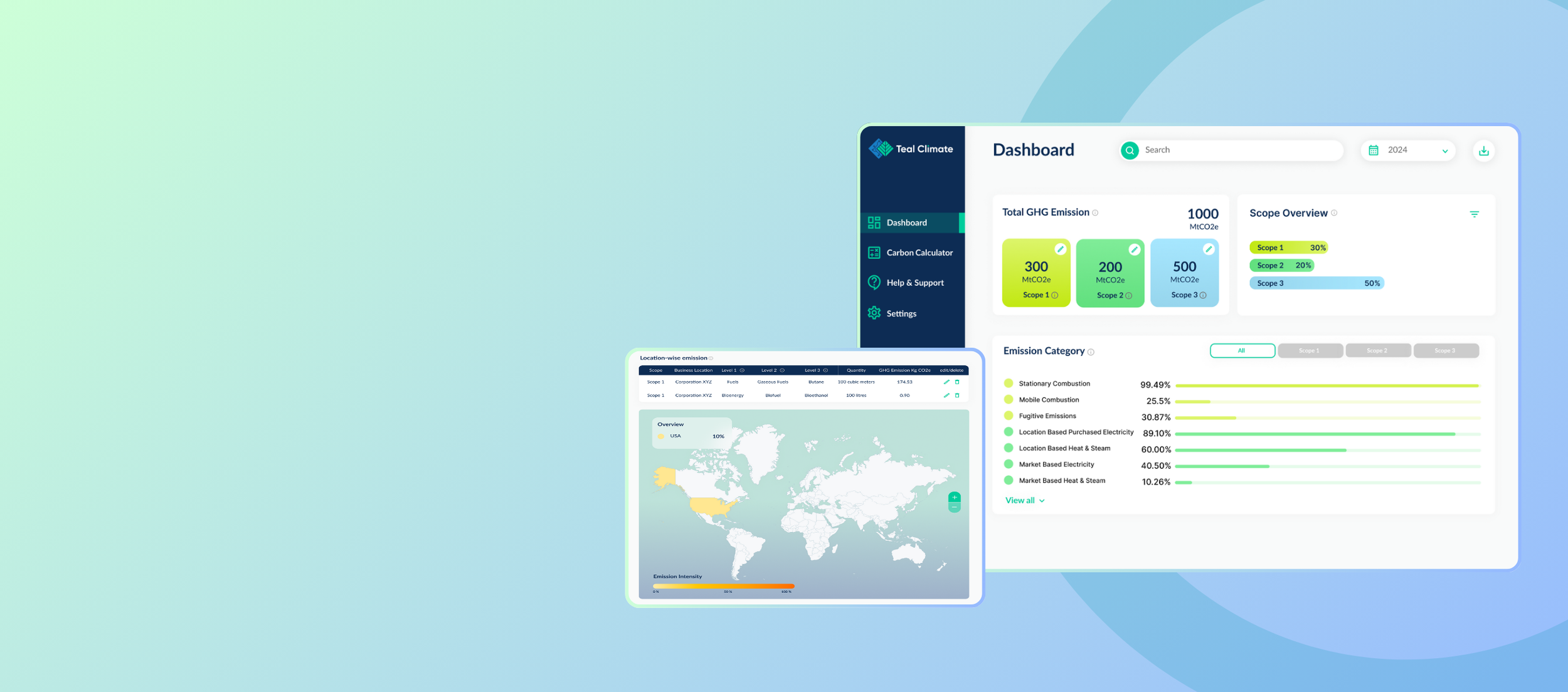
To summarize, in the final designs, findings from usability testing were carefully integrated, addressing key issues identified to enhance the overall user experience. Additionally, the style guide underwent updates to align with the client's desire for a more modern aesthetic. These refinements were made based on client recommendations and feedback, ensuring that the platform not only meets user needs but also reflects current design standards and preferences. Below is a comparison of the current design and the redesigned platform:
Original dashboard interface

Redesigned dashboard interface

Original dashboard interface

Redesigned dashboard interface
Key Issues:
Overwhelming Data Presentation: Users are bombarded with all data at once, leading to overwhelm and difficulty in interpretation.
Inconsistent Charts for Scope 1, 2, 3: Lack of uniformity in chart styles for different scopes may cause confusion.
Color Duplication: Multiple items are represented by the same color, causing ambiguity, and making it challenging to differentiate between data points.
Lack of User Control: Users have no control over data viewing options, limiting customization.
Changes applied:
Improved Data Representation: Implemented hierarchical organization of data, with added ability to view both in MtCO2e and percentage format, providing flexibility in analysis and interpretation.
Consistent chart styles: Replaced pie charts with bar graphs to ensure consistent representation of data, particularly for large numbers.
Color Differentiation: Assigned colors to each emission scope for easy understanding of emission category.
Terminology: Now, users can simply hover over the info icon next to any unfamiliar terminology to gain deeper insights and understanding.
User control: Ability to filter data, allowing users to select and focus on specific data subsets according to their preferences.
Key issues:
Lack of Scope Editing: Users cannot edit scopes directly, requiring them to backtrack to the activities section to make changes or add additional data, resulting in inefficiency and frustration.
Limited Information Accessibility: Users are required to hover over each country on the map to view the percentage, which impedes quick data access and may lead to user frustration.

Changes applied:
Streamlined Scope Editing: Added edit button on the dashboard so users can seamlessly navigate to specific data point they wish to modify.
Improved Information Accessibility: The top 5 emissions from business locations are displayed on the map interface eliminating the need for users to hover over each individual country to view the percentage.
05. Conclusion & Reflection
In conclusion, the client expressed great satisfaction with the final outcome of the project, with some minor suggestions for UI refinements. Despite this, redesigning the entire SaaS platform using design thinking methodologies within a tight timeframe of 5 weeks felt incredibly rewarding. Our efforts focused on resolving user issues and minimizing clicks, resulting in a sense of accomplishment.
Key Takeaways:
This project provided invaluable insights into greenhouse accounting and the nuances of Scope 1, 2, and 3 emissions. It challenged me to translate complex information into a visually accessible format for users, a task I found both stimulating and fulfilling. Redesigning the style guide was particularly challenging, requiring numerous iterations to ensure alignment with the brand.
Collaborating with two other designers, working in different time zones, presented coordination challenges that we overcame through regular communication and weekly discussions. However, working with a less collaborative team member posed additional hurdles, requiring us to assist with their designs and take on extra work to meet deadlines.
Testing also proved challenging due to the limited availability of users within the sustainability field within a short timeframe.
Given more time, I would have conducted further testing to validate the effectiveness of the changes and address any lingering issues. Additionally, starting user recruitment earlier would have alleviated the rush and pressure associated with the limited timeframe for testing.
Overall, working with Teal Climate was a gratifying experience. The client's receptiveness to new ideas and feedback fostered a collaborative atmosphere that contributed to the project's success. Moving forward, I am eager to apply the lessons learned from this project to future endeavors, striving for continual improvement and innovation in design practices.
Thank you so much for reading my case study, feel free to leave any feedback below.
View More Projects

BudgetBliss - Redefining Affordable Travel
Provides travelers access to budget-friendly deals and enables them to confidently make informed decisions, track their expenses, curate their itineraries, and enjoy memorable vacations within their financial constraints.

House2Home E-commerce Website for New Homeowners
House2Home is a home decor e-commerce website, helping new apartment or home owners to confidently curate a diverse array of home décor items and accessories to decorate their spaces according to their unique style and budget.