BudgetBliss
Redefining Affordable Travel Experience
Provides travelers access to budget-friendly deals and enables them to confidently make informed decisions, track their expenses, curate their itineraries, and enjoy memorable vacations within their financial constraints.
Overview
Many travelers seek enjoyable yet affordable vacations, encountering challenges in finding affordable deals without compromising on the quality of their experience. They express frustration with the steep prices and extensive research required for vacation planning. Having personally encountered these challenges myself, I wanted to learn about other users and their problems, thus embarked on a four-month journey to tackle and solve this issue.
The outcome was my app BudgetBliss - a design thinking, user-centric vacation planning app.
BudgetBliss is your passport to stress-free vacation planning, revolutionizing decisions with exclusive budget-friendly deals and customizable itineraries. Embrace unforgettable journeys within your financial boundaries.
Because planning a stress-less vacation should be stress free itself.
-
Research & Understand, Ideation, Design, Prototype, Test and Reflect
-
4 months ( July to November 2023)
-
Figma, Figjam, Miro
Click to Use Prototype

The Problem
Many budget conscious travelers desire enjoyable vacations but struggle to find reliable information and tools for informed decision-making. Challenges include finding affordable accommodations, transportation, and activities without compromising quality.
The Solution
I created a user-centric mobile app that simplifies the budget vacation planning process by allowing users to find options based on their budget, provides them with personalized recommendations, reliable information, and tools to track expenses. It enables users to confidently make informed decisions, curate their itineraries, and enjoy memorable vacations within their financial constraints.

-
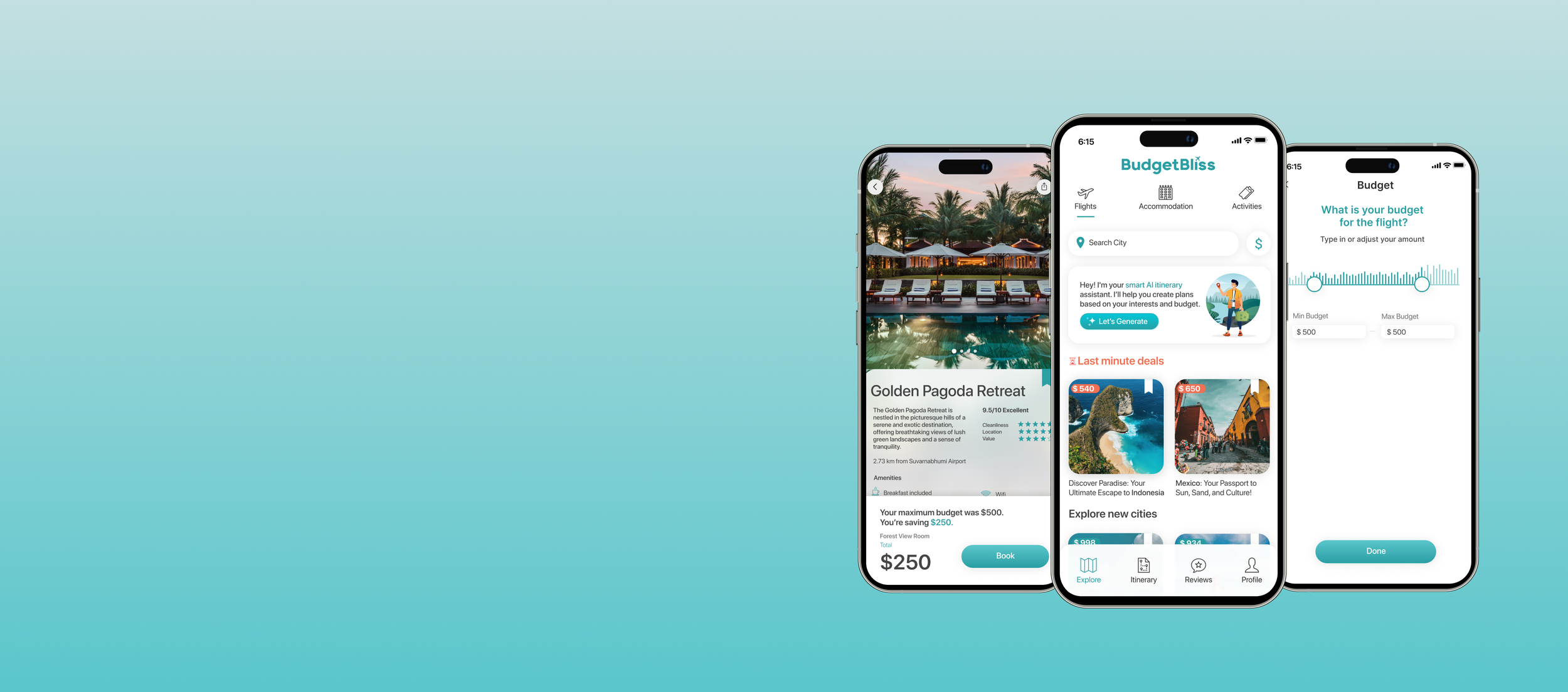
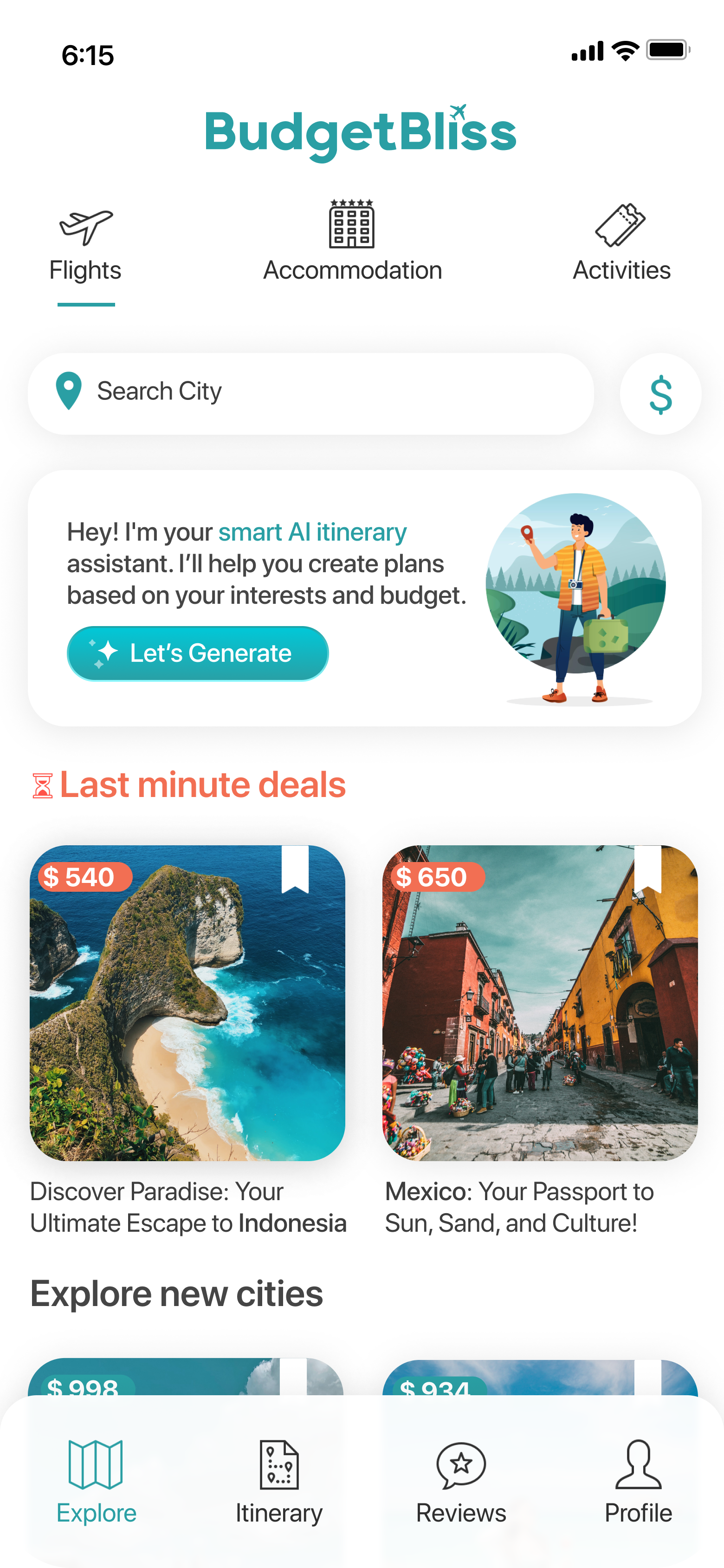
![]()
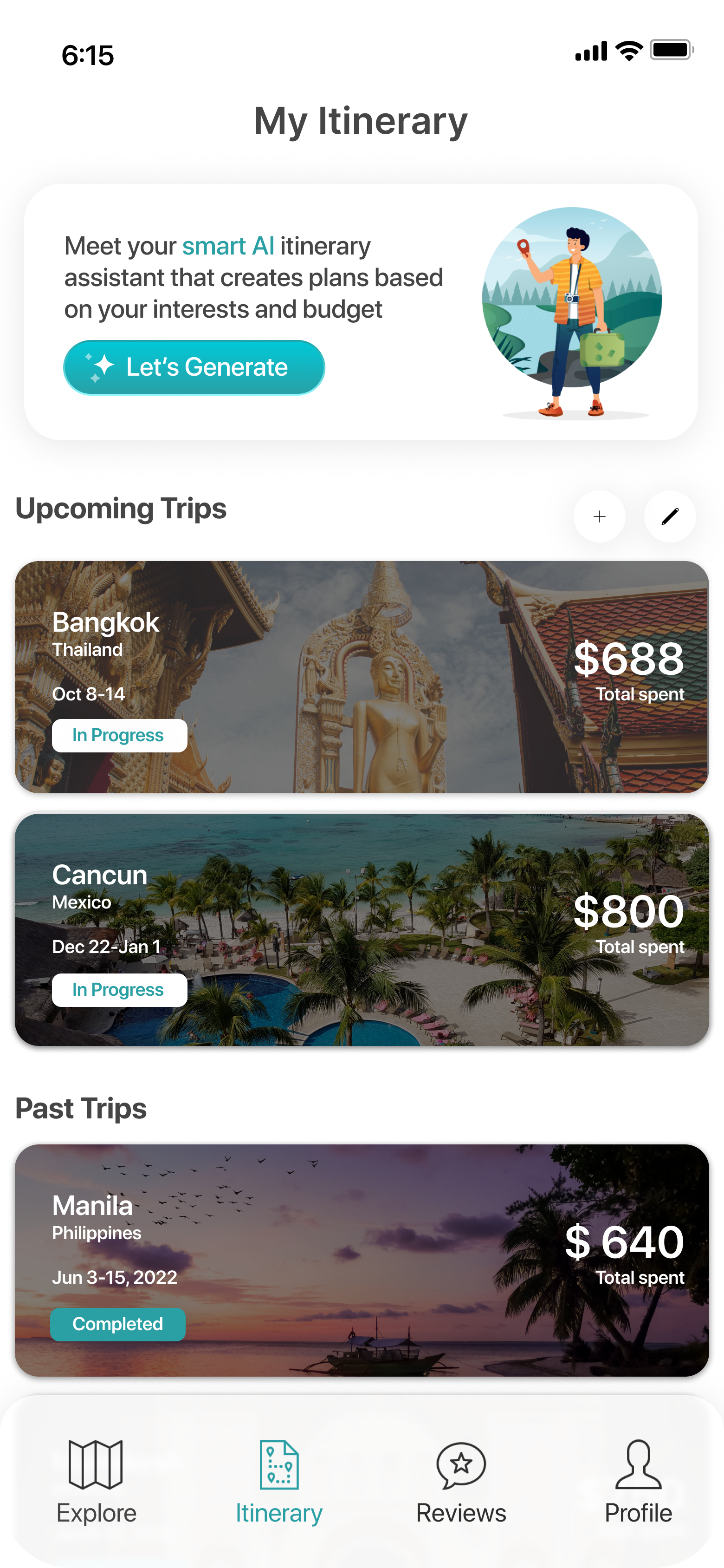
Main Page
-
![]()
Selection Page
-
![]()
Itinerary
-
![]()
Reviews


01. DISCOVER
Despite numerous vacation planning tools, crafting the perfect trip within budget remains a time-consuming challenge. As an avid traveler, I've experienced this struggle and I recognized the need to go beyond my own experiences and immerse myself in qualitative and quantitative research to identify the core issues affecting user satisfaction in vacation planning.
Secondary Research Insights
While working on my secondary research, I came across an interesting study which was the starting point of my design journey.
According to Expedia's study, Canadian travelers visit an average of 160 websites while planning their vacations. This quantitative data highlights the extensive research and effort to find the best deals and options.


Unveiling Travelers' Dilemmas: Insights from User Surveys & Interviews
In a comprehensive user survey, a striking 50% of respondents highlighted their difficulties with vacation planning.
To delve deeper, I conducted semi-structured remote interviews with 5 avid travelers sourced from the survey who experienced difficulty in vacation planning. These interviews focused on key inquiries:
What are their main struggles when planning a vacation?
What tools are they currently using to plan their vacation?
What tools would make their vacation planning easier?
The findings from this user research revealed a consistent pattern: Cost emerged as the foremost hurdle, closely trailed by information overload and the substantial time investment in planning. Moreover, underlying factors surfaced, including concerns about overspending, decision paralysis, and the absence of accessible planning tools guiding them toward well-informed choices.
Empathy Mapping
Using Empathy Mapping I delved into users thoughts, feelings, needs, and motivations.
Participants shared experiences such as feeling shocked by their expenses upon returning from a trip
Believing that more research could have made better decisions
Some shared their desire to meticulously plan every detail
Additionally, they expressed a preference for others' experiences and opinions over simple Google search.


Affinity Mapping
Furthermore, through affinity mapping, I organized and analyzed qualitative research, identifying patterns, like similar concerns with budget, gaps in planning, and helpful insights on things that would help. Key findings from the research:
1. Information Overload and Time Consumption: Users expressed frustration with the abundance of online information, often spending weeks navigating through options before finalizing a vacation plan. The overload led to decision paralysis, delaying bookings.
2. Difficulty Finding Deals and Trustworthy Information: Difficulty in locating budget-friendly options and trustworthy information left users feeling overwhelmed by overhyped destinations and scarce reliable reviews.
3. Value in Personal Recommendations: Users highly valued personal recommendations from trusted sources such as friends, family, or locals, often favoring these over online searches.
4. Expense Tracking Challenges: Despite available planning apps, users resorted to manual methods like Excel or Google Docs for planning and expense tracking. Post-trip, many users were shocked by their overall expenses, seeking better financial management tools within planning platforms to monitor and manage their vacation budgets effectively.
The Target Users: Crafting Solutions for Varied Travel Needs
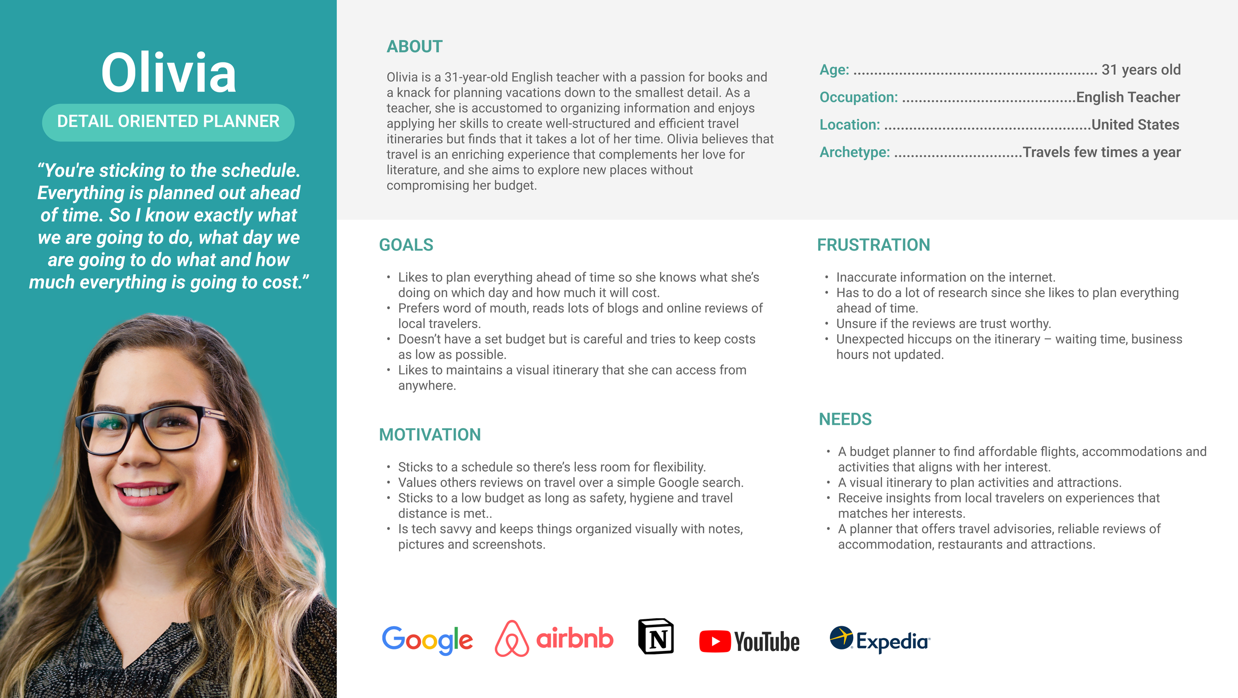
Through empathy and affinity mapping, I created 3 distinct user personas that embody unique needs and frustrations, serving as the foundation for shaping the requirements of an ideal planning solution.
Olivia - the detail oriented planner
Struggling with overwhelming options and unreliable reviews, she seeks affordability, trustworthiness, and a streamlined itinerary.
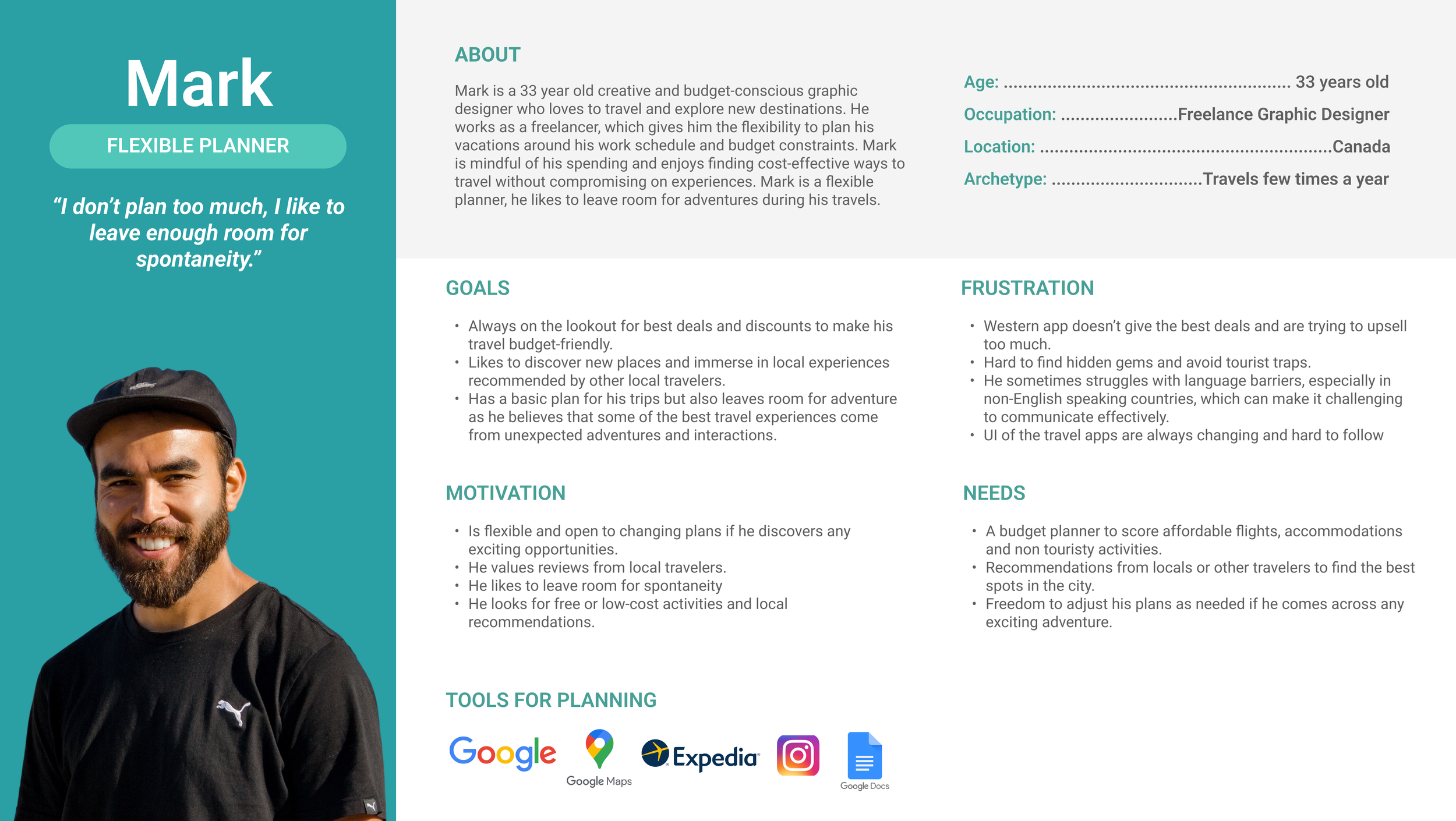
Mark - the adaptive planner
Facing challenges with booking flexibility and information reliability, he desires an app that's reliable and adaptable to his spontaneous nature.
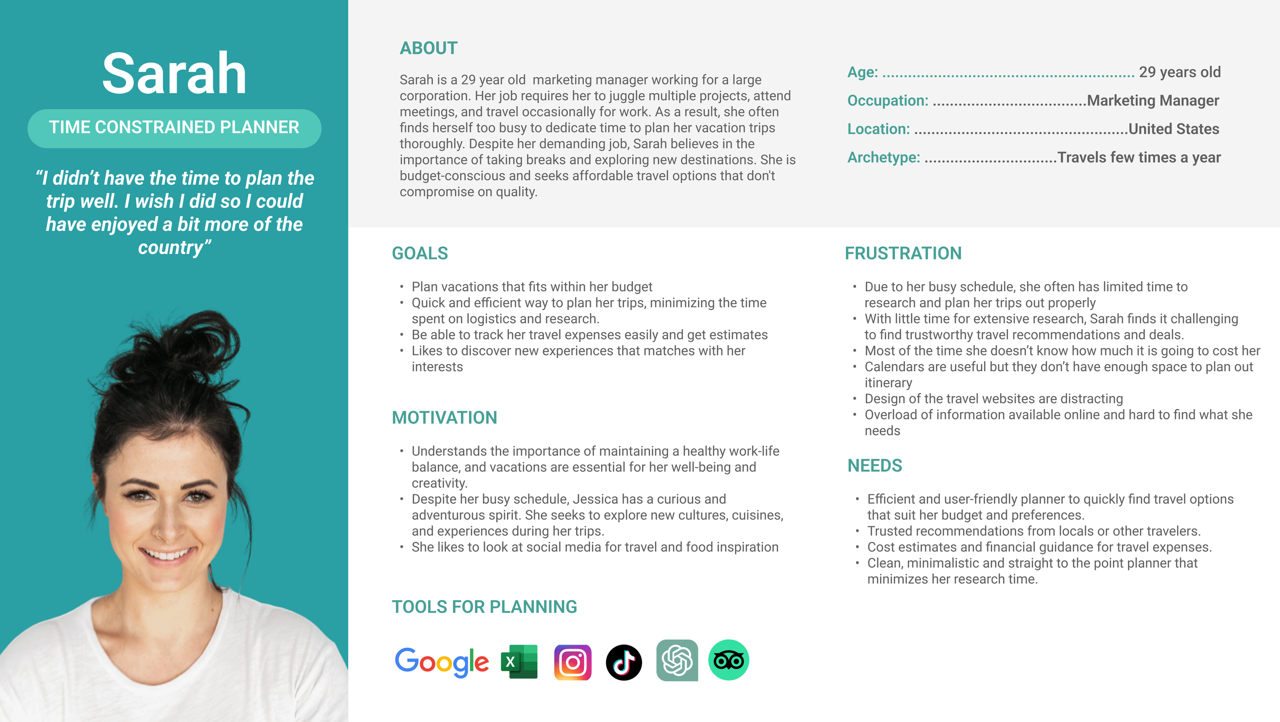
Sarah - the time-constrained planner
Juggling limited time and budget constraints, she seeks an efficient, last-minute-friendly planning tool.
02. IDEATE
Amidst the array of challenges, I began by pinpointing essential functionalities crucial for my user personas. These included:
Seamless Exploration: Streamlining the search for affordable flights, hotels, and activities.
Financial Clarity: Offering guidance on expenses and savings to enhance financial awareness.
Informed Decision-making: Providing comprehensive suggestions and reviews for informed choices.
Accessible Itinerary: Creating an accessible itinerary accessible from anywhere.
These functionalities were identified as pivotal for user experience. Consequently, I crafted the Minimum Viable Product (MVP) focusing on these core features, ensuring a robust foundation to address users' primary needs.

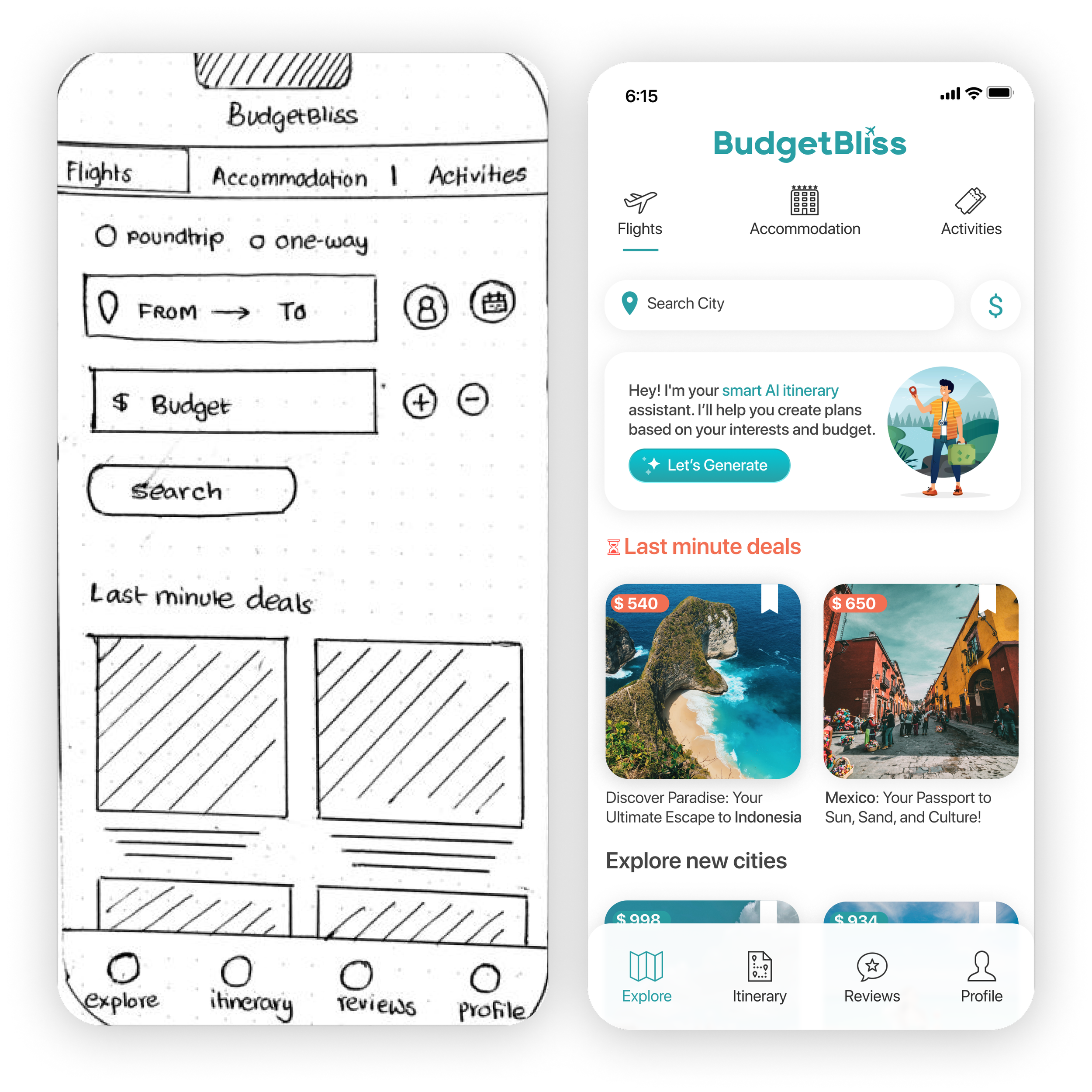
THE MVP led me to sketch first few screens:

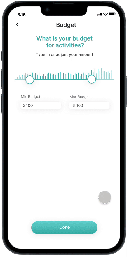
Finding deals within budget
User sets minimum and maximum budget for flights, hotels, and activities in their desired destination.

Expense tracking
Enables users to track savings per booking and see overall trip expenses, ensuring adherence to budget constraints.

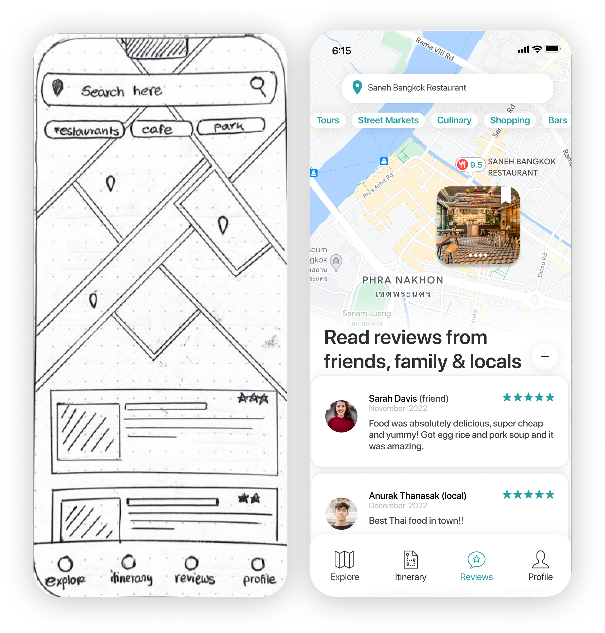
Trustworthy reviews
Provides access to reviews from trusted sources—friends, family, and locals—with experiences on similar destinations for informed decision-making.
Guerrilla Testing the Foundations: Assessing User Navigation and Budget Features

With low-fidelity sketches, I started conducting guerrilla usability testing. For this test, I recruited five participants at random online. The focus was on evaluating navigation skills, task completion, and understanding of budgeting features. The aim was to uncover usability issues and ensure the app meets users' needs efficiently.

Observation: Users hesitated to book flights due to limited information in low-fidelity sketches.
Improvement: Introduced a Review Selection page for users to review and confirm their choices before redirecting to the booking page, providing clear and comprehensive information.

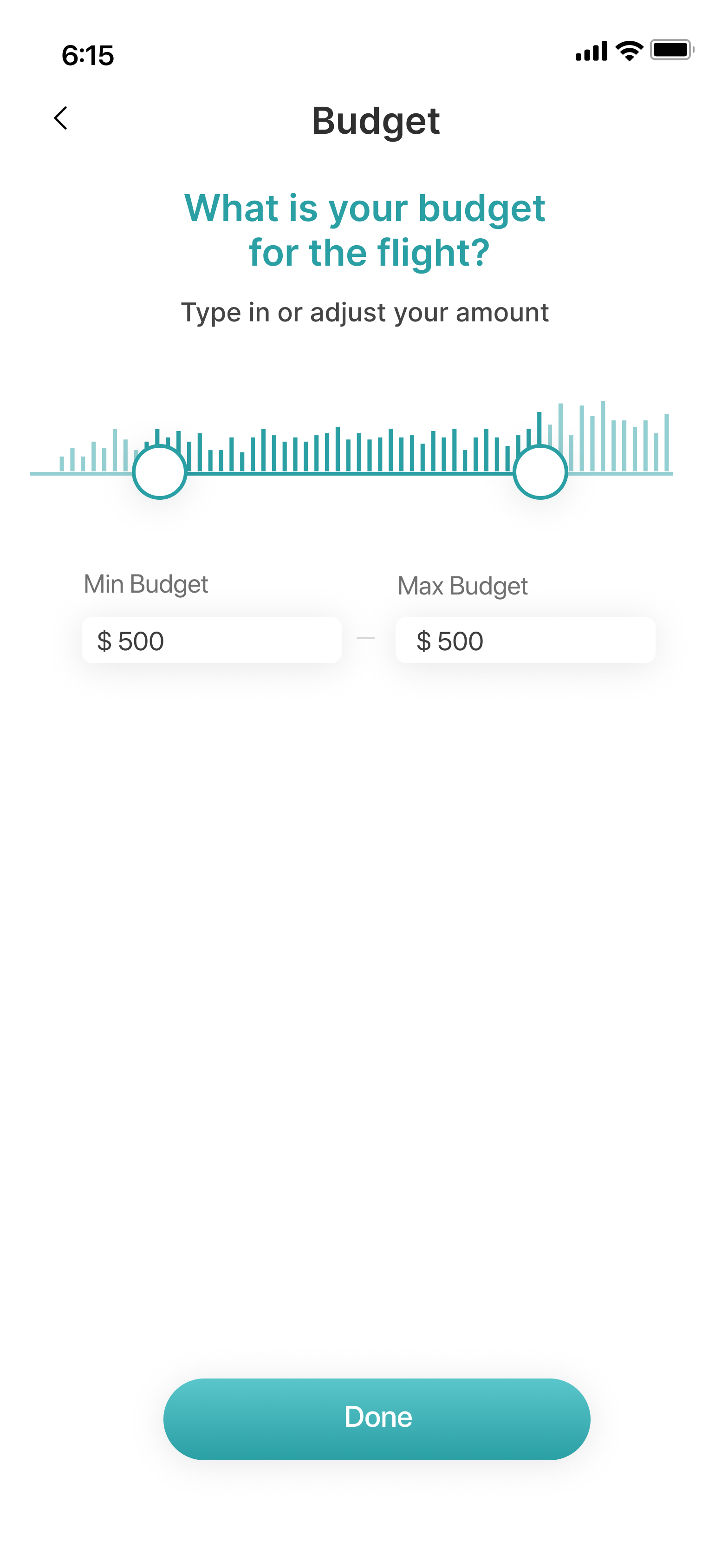
Observation: Users often didn't start searches with a set budget. They preferred a filter for adjusting budgets during searches, expressing a preference for a slider bar over the + and – buttons.
Improvement: Repositioned Budget Feature - Moved it to the filter section as a slider bar for improved user experience, enabling easy budget adjustments for flights, accommodation, and activities. Further testing needed for refinement.

Observation: Users expressed interest in a 'Save Option' to save selections for future booking reference.
Improvement: Implement a Save Option: I decided to include a ‘save button’ to enable users to save flight, hotel, or activity selections, in their itinerary as Wishlist for easy access and future bookings.
03. DESIGN
Brand Identity: The Visual Narrative of Affordability and Exploration
Crafting the app's style guide and branding involved a purposeful emphasis on visual storytelling. Aligned with the brand attributes of affordability, efficiency, inclusivity, and inspiration, I selected a 'sea blue' primary color palette, symbolizing calmness and exploration. To convey affordability, the curated imagery showcases inviting yet budget-friendly accommodations. The design strategy prioritized a clean, minimalistic UI for a simple and efficient user experience, adhering to accessibility standards and WCAG guidelines. This cohesive approach aimed to resonate with the brand's essence while ensuring an inclusive and streamlined user interface.


High Fidelity Screens
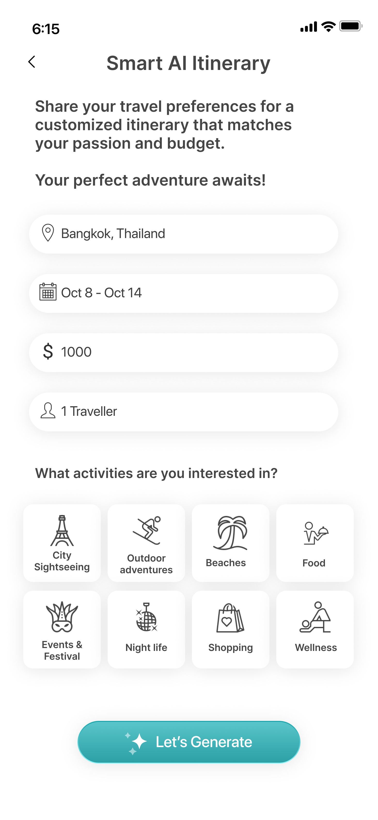
After establishing the branding, I designed high-fidelity mockups rooted in insights from usability testing. Taking a step back, I reassessed user personas, identifying an unmet need in Mark and Sara's journey. To address this, I introduced the Smart AI itinerary assistant, tailored for users with time constraints. This feature revolutionizes itinerary creation, providing swift access to curated content.

04. TEST
Usability Testing
To validate the high-fidelity prototype, I conducted two rounds of moderated usability testing. Participants were recruited from Slack, social media outreach and online communities for travel and engaged in one-on-one Zoom sessions.
The goal of the testing was to evaluate the overall user experience of the mobile application. Objectives included:
Assessing user’s impression of the budget feature and if they are successfully able to make use of the functionality.
Identifying usability problems in user journey, particularly focusing on finding budget friendly options and for flights, accommodation, and activities.
Understanding how participants respond to the flow and information architecture of the application.
Homepage navigation:
What are your initial thoughts on the homepage layout?
Booking budget-friendly flights:
How would you book a suitable flight within a $500 budget for a solo trip to Bangkok
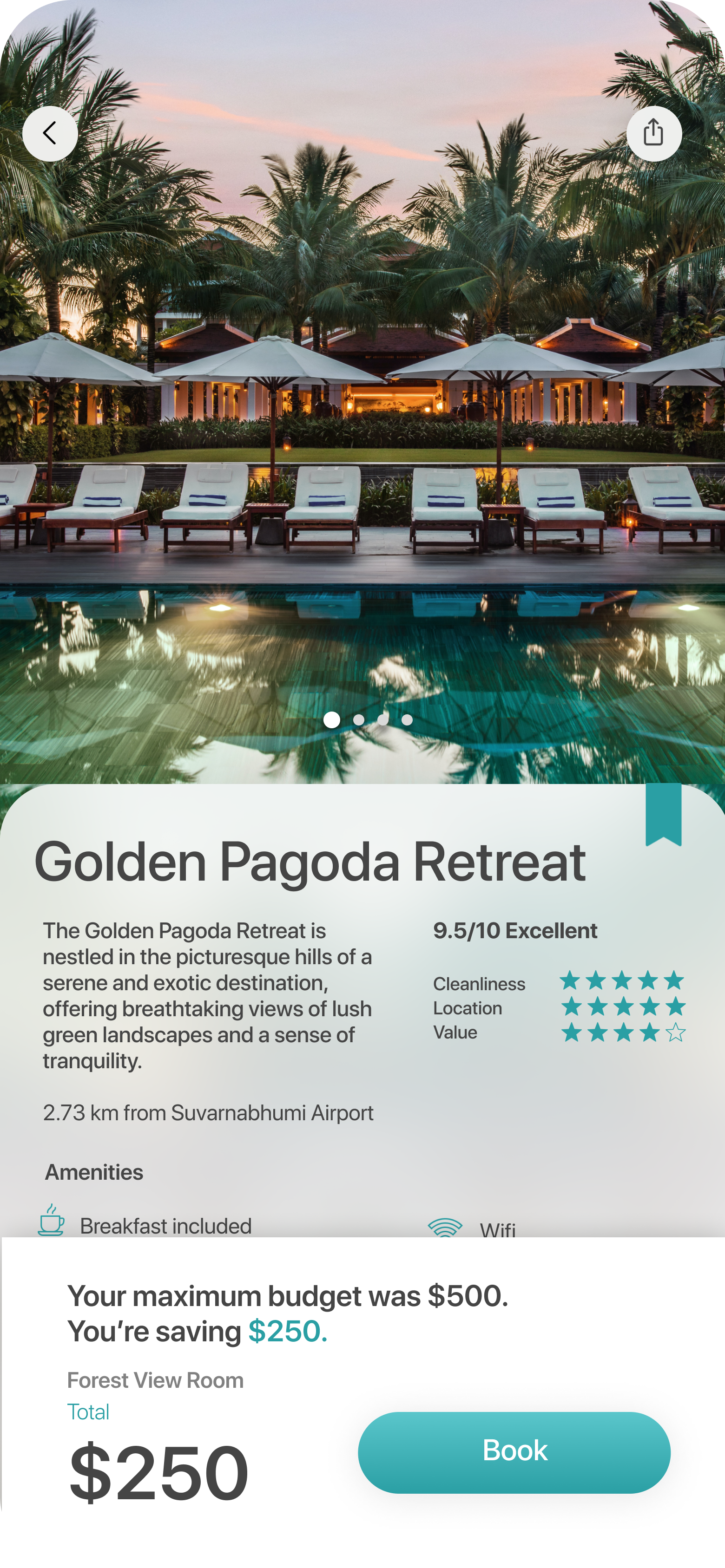
Budget-friendly accommodation search:
How would you find suitable accommodation within a $500 budget for Bangkok?
Exploring budget-friendly activities:
After booking a flight and hotel, what's your process to explore activities in Thailand.
Adding activity to wishlist:
How do you add an activity to your wishlist for later viewing?
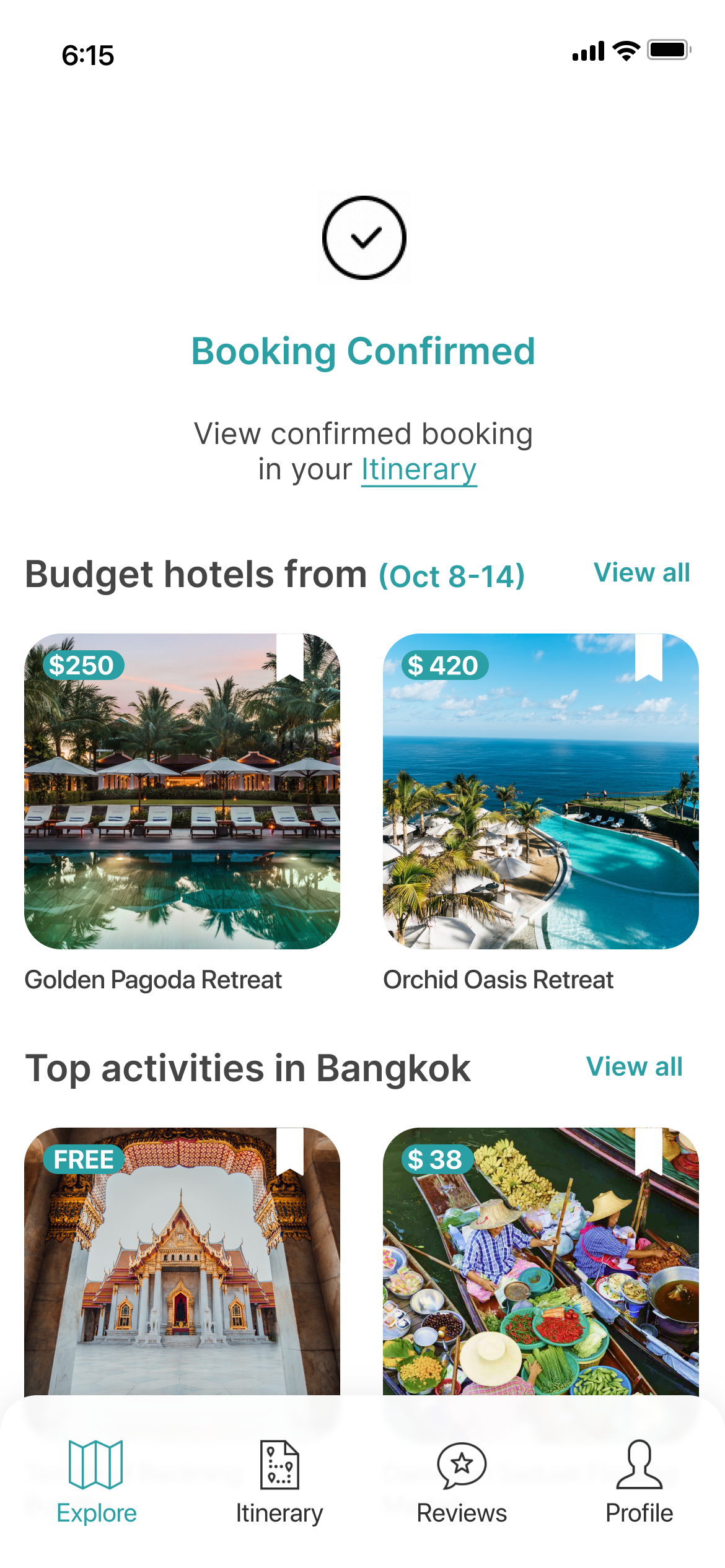
Accessing confirmed itinerary:
Where do you find your confirmed travel plans within the app?
Checking total expense and savings:
How would you locate and view the total expenses for your Bangkok trip?
Creating smart AI Itinerary:
Using the app's AI feature, how do you quickly create an itinerary with time constraints?
Reviews search:
Where would you check reviews for a restaurant in Bangkok before making a reservation?
Findings and Final Improvements
Round 1 Testing :

Budget Icon Clarity
Users encountered difficulty locating and understanding the functionality of the budget icon.
4 out of 5 users faced challenges identifying the budget icon and functionality.
Assumed icon represented ‘currency’
Felt icon wasn’t very prominent displayed or expected it to be in the filter section
Confusion with Wishlist Icon
Users struggled to comprehend the meaning of the bookmark icon and its feature.
3 out of 5 users were confused and had varied assumptions such whether it involved the option to ‘save’ or signified ‘popular choice’ or ability to creation collections like on Instagram.

Repetitive Navigation Back to Home Screen
Users felt repetitive navigation to the home screen was inconvenient for successive booking steps.
When asked to book a hotel after flight, users expected to find hotel options on the confirmation page based on the dates they have booked their flight for.
Users did not expect to go back to Main page to start their search again.
Round 2 Testing:

Solution
In order to enhance user understanding of the budget and wish list features, I introduced onboarding screens. These screens guide users through the functionalities of these features, offering a clearer and more intuitive experience.
In Round 2 Testing, 4/5 users were easily able to identify the budget and wishlist icons and its functionality from the onboarding screen steps.

Solution
To streamline the user experience and eliminate the need for repetitive navigation to the home screen for accessing accommodations and searching for hotels, I implemented a hotel list directly on the confirmation page. This allows users to effortlessly browse through available options without the hassle of searching again.
During Round 2 Testing, all five users successfully navigated through the hotel options without encountering any issues related to repetitive navigation.
The design journey led to final solutions, meeting essential needs for the target users:
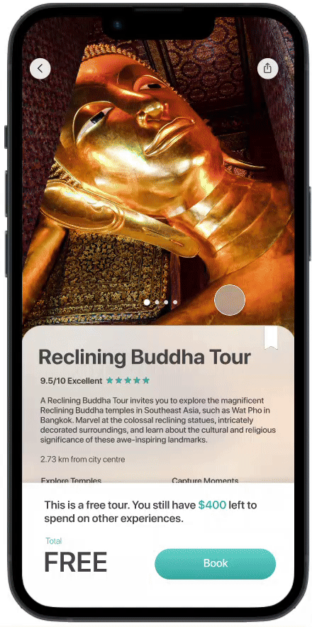
Finding options based on budget
Users struggled with the cost as the primary challenge in vacation planning, spending hours searching for affordable options. BudgetBliss addresses this by providing a budget feature, streamlining the process and ensuring users find options within their budget without hidden costs.
Effortlessly monitor expenses
BudgetBliss enables users to effortlessly track real-time spending and savings for instant bookings. This feature ensures comprehensive financial management, preventing overspending. Users also access past and future trip expenses for easy comparisons, with the overview page offering a clear picture of their finances across various activities.

Itinerary
The itinerary feature revolutionizes planning, replacing manual expense tracking with a visually appealing, accessible, and efficiently managed tool. Its smart AI simplifies the process for busy users, curating personalized itineraries based on interests with just a few clicks. This eliminates extensive research and makes planning effortless.

Reviews
The review page offers insights on everything from hotels to cafes and experiences. It sources reviews from verified locals and trusted friends, ensuring trustworthy recommendations for informed decision-making.


05. REFLECT
Conclusion and Reflections
Overall BudgetBliss received positive feedback for its intuitive design and useful features, with suggestions for improvement in iconography, functionality explanations, and integrated reviews. Enhancing these areas could further elevate the app's usability and user satisfaction.
Given more time, improvements would include:
Streamlining Review Integration: Integrate reviews into the selection process and enable users to review completed trips within the app. Introduce gamification to incentivize users to share reviews, unlocking discounts and deals for a richer user experience.
Enhanced Expense Overview: Create a comprehensive overview of travel expenses across categories, aiding users in identifying areas for spending reductions or improvements for better financial management within the app.
Group Trip Functionality: Introduce the ability to create and manage group trips, simplifying planning for multiple travelers and ensuring a seamless experience for group travel arrangements.
Factors beyond control include budget ambiguity and external economic influences impacting users' perceptions of affordability. The app can facilitate discovering budget-conscious choices but can't mitigate the overarching trend of rising vacation expenses due to factors like inflation rates.
BudgetBliss revolutionizes travel within budget constraints, offering authentic, first-class experiences to redefine travel expectations in a landscape crowded with upselling and misleading information.
“I am planning a trip to Europe, and I wish I had this app now; it would make my planning a lot easier.”
- quoted by a user
This case study was done as part of a UI/UX Springboard Career Track academic project. Thank you for reading and feel free to leave any feedback😊
View more projects

House2Home 5 day Google Venture Style Design Sprint
House2Home is a home decor e-commerce website, helping new apartment or home owners to confidently curate a diverse array of home décor items and accessories to decorate their spaces according to their unique style and budget.