House2Home
A modified Google Venture Design Sprint project conducted over the course of 5 days as a solo designer.
Overview
House2Home is an e-commerce website that sells home décor items and accessories. Through customer survey, it was found that many of their customers have moved into a new apartment. The users want to buy multiple items to personalize their new place but don’t feel confident doing it on their own. House2Home sees an opportunity to create a starter kit of items to instantly decorate their new place.
-
5 days
-
Day 1 - Mapping
Day 2 - Sketch
Day 3 - Decide
Day 4 - Prototype
Day 5 - Test
-
My role as a UI/UX designer in this project was to analyze user interview notes and recordings, analyze data, map out user flow, sketch storyboard, design prototype and conduct usability testing.
-
Figma, Adobe Illustrator, Figjam. Procreate
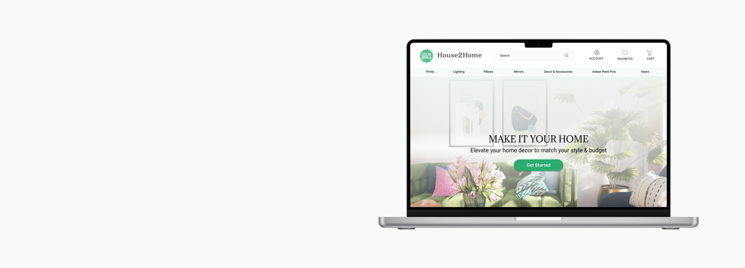
View Prototype

The Challenge
Moving into a new apartment is an exciting phase, yet the process of decorating can pose significant challenges. Often, individuals envision a particular style or aesthetic but struggle with decision-making when it comes to selecting items that align with this vision. Moreover, budgetary constraints add another layer of complexity, making it daunting to find decor within a desired price range.
Design Constraints
Conceptualize and design a user-friendly website as the go-to solution for apartment decoration.
Emphasize the creation of a versatile 'starter kit' that includes a diverse range of products.
Prioritize affordability by featuring products with price points falling within the $10-$50 range.
DAY 1: Map
To comprehend user pain points and goals, I organized research data through affinity mapping. I categorized interview notes and recordings by individual users, identifying common themes such as user wants, needs, frustrations, budget constraints, and decision-making challenges. This process provided valuable insights into user perspectives and guided subsequent design decisions.
Key Insights from research synthesis:
Users had a vision for their space but were uncertain about achieving the desired look with decor.
Decision paralysis arose from the overwhelming online decor choices, hindering purchase decisions.
Budget constraints posed challenges, making it difficult for users to find affordable decor options.
User Persona

I then started mapping to understand and visualize the end-to-end experience a user might have with House2Home.
Prospective apartment or home owners would start their journey by searching home decor on their web browser. Upon discovering House2Home, they would fill up a brief questionnaire tailored to assist them in exploring decor bundles aligned with their style and budget. Following the selection, the user can seamlessly add items to their cart, proceed to checkout, and, finally, complete the process with the delivery of the chosen bundled decor.

The User research and persona led me to create these How might we(HMW) questions to help frame problems in a way that encourages creative and innovative solutions:
How might we help users find décor according to their vision?
How might we help users decide which decor items to pick?
How might we help users find décor items that fit within that budget?
How might we help users streamline their choices?
How might we help users decorate their apartment without overwhelming them with a lot of options?

DAY 2: Sketch
On Day 2, I began with competitive analysis, dissecting other website approaches to solving similar challenges. I scrutinized various screens and interfaces, closely studying how they presented their products. This deep dive into competitor strategies served as both inspiration and a strategic guide, allowing me to gain valuable insights on designing a solution that would optimally address the challenge at hand.


I liked their questionnaire system and how it simplifies understanding user preferences in style, aesthetic, and budget, facilitating a personalized design process. It’s also helpful for users who aren’t exactly sure what the style of décor they like is called, e.g. Mid-century modern, minimalistic, boho etc.
Havenly: An online platform connecting users with interior designers to create personalized home designs through style quizzes, designer collaboration, and curated shopping lists for furniture and decor.

2. IKEA: A global retailer offering affordable, modern, and self-assembled furniture, home accessories, and decor, known for its functional designs and Scandinavian aesthetic.
I liked their visual visual presentation of tagged items which allows users to envision decor within a space, offering easy visualization alongside product details and pricing for convenient scanning. This helps user see how a décor is styled in a space to give them better visualization and help them make decisions.

Pottery Barn: An American home furnishing brand renowned for its stylish and high-quality furniture, blending modern and traditional designs, catering to various interior styles, and offering a range of home accessories and decor.
I liked how the website layout showcases styled small spaces, enabling users to explore corresponding items available for purchase below, streamlining the selection process through visual context.
Crazy 8 Solutions
With the research materials, mapping and lightning demos done, I moved on to do crazy 8 sketches depicting 8 different sketches of solutions.
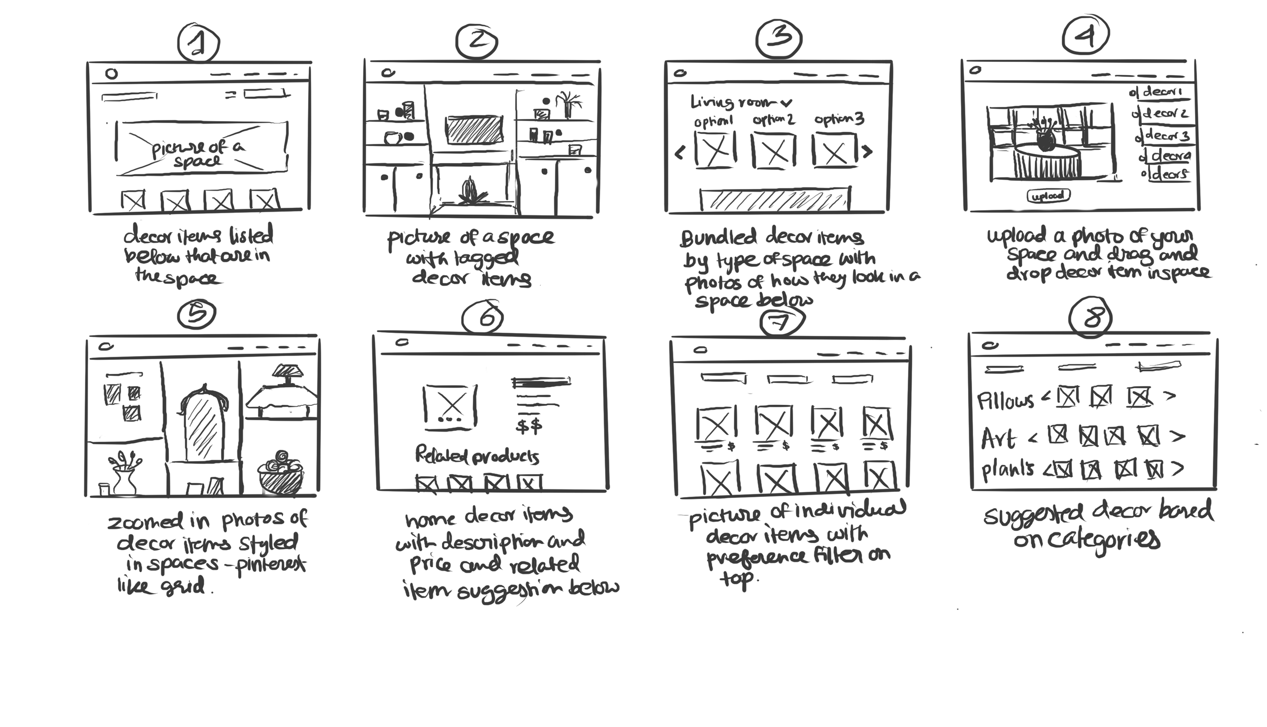
While all the solutions looked viable, sketch 2 looked the perfect solution as it would show the user how decors are styled in a room. They would be easily able to hover and learn about each item, they would have ability to buy individual décor separately or buy as a bundle. With this solution in mind, I sketched out the before and after screens of the critical screen.
Solution Sketch
The crucial steps in the process involved completing a comprehensive questionnaire to tailor decor suggestions based on style and budget.
Prior to reaching the pivotal screen, users would specify the type of room they are decorating, set their budget, and choose from an extensive array of room styles.
Once these selections were made, the site would propose bundled decor arranged in a visually coherent space, allowing users to easily visualize the outcome. To prevent overwhelming users with numerous options, the layout is designed to present a singular room in a full space, with additional choices available below for effortless scrolling and streamlined selection.
Following this, the subsequent screen showcased the user's ability to hover over tagged items for more information or purchase them individually if desired.
DAY 3: Decide
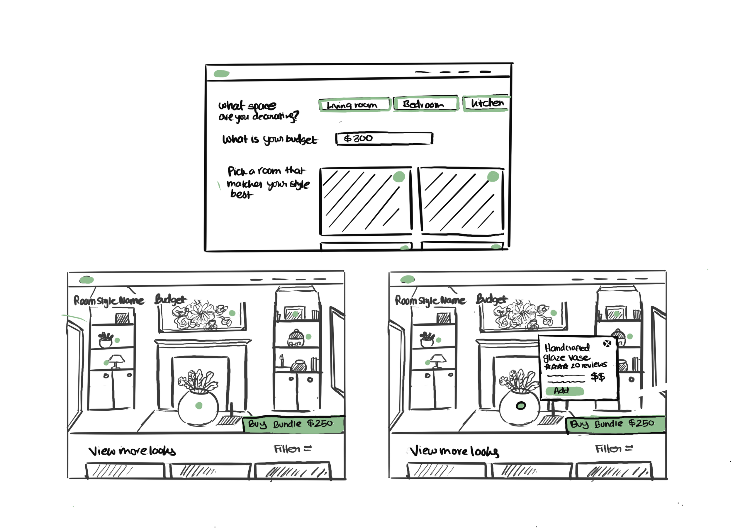
On Day 3, I crafted a 13-panel storyboard, a concise sketched wireframe serving as the foundation for my prototype to be developed on Day 4 of the sprint. Following the GV design sprint methodology, I outlined the main screens crucial for user interaction in completing the task. Leveraging insights gained from user journey mapping on Day 1, I began constructing the storyboard, focusing on guiding users through the process of selecting decor aligned with their style and budget. The narrative unfolds as the user discovers the House2Home website, engages in a questionnaire to refine decor choices based on style, room, and budget, views suggested decor in a styled space, explores individual items, adds bundled decor to the cart, and confidently makes a purchase decision.

DAY 4: Prototype
On Day 4 of my design sprint, I initiated the prototype development process, drawing inspiration from the 13-panel storyboard I meticulously crafted. Opting for Figma as my platform of choice, I dedicated myself to constructing 14 screens tailored for testing the Minimum Viable Product (MVP) with users on Day 5. My strategy began with the creation of foundational components, focusing on the essential elements crucial for evaluating design functionality. The primary objective was to work swiftly and efficiently, adhering to the principles of a lean approach. This involved prioritizing speed without compromising the realism of the designs, fostering an environment where both efficiency and authenticity converge for effective user testing.
Key Screens

DAY 5: Test
On Day 5, I conducted moderated usability test with 5 participants who were recruited earlier in the week and participated in a one to one zoom session to test the prototype. The goal of testing the prototype was to see:
If users are easily able to find the décor based on their style and budget.
If they understood the Bundle kit onboarding questionnaire.
If the experience overwhelms the users or they are able to make their choices confidently and purchase the product.
If the user understood the proposed design and if they encountered any usability problems on the website.
The users were given a set of tasks to complete to see if they could find décor according to their style and budget, aiding decision-making, and ensuring a streamlined user experience. Tasks included:
You have just moved into a new apartment and are looking to buy some décor to decorate your place based on your style and budget. Where are you going to look on the website?
You want to decorate your space, style and budget to view the decors available.
You want to buy the décor bundle, complete the process to order.
Key Findings
The usability test yielded valuable insights into user experiences and preferences, guiding the identification of key areas for improvement:
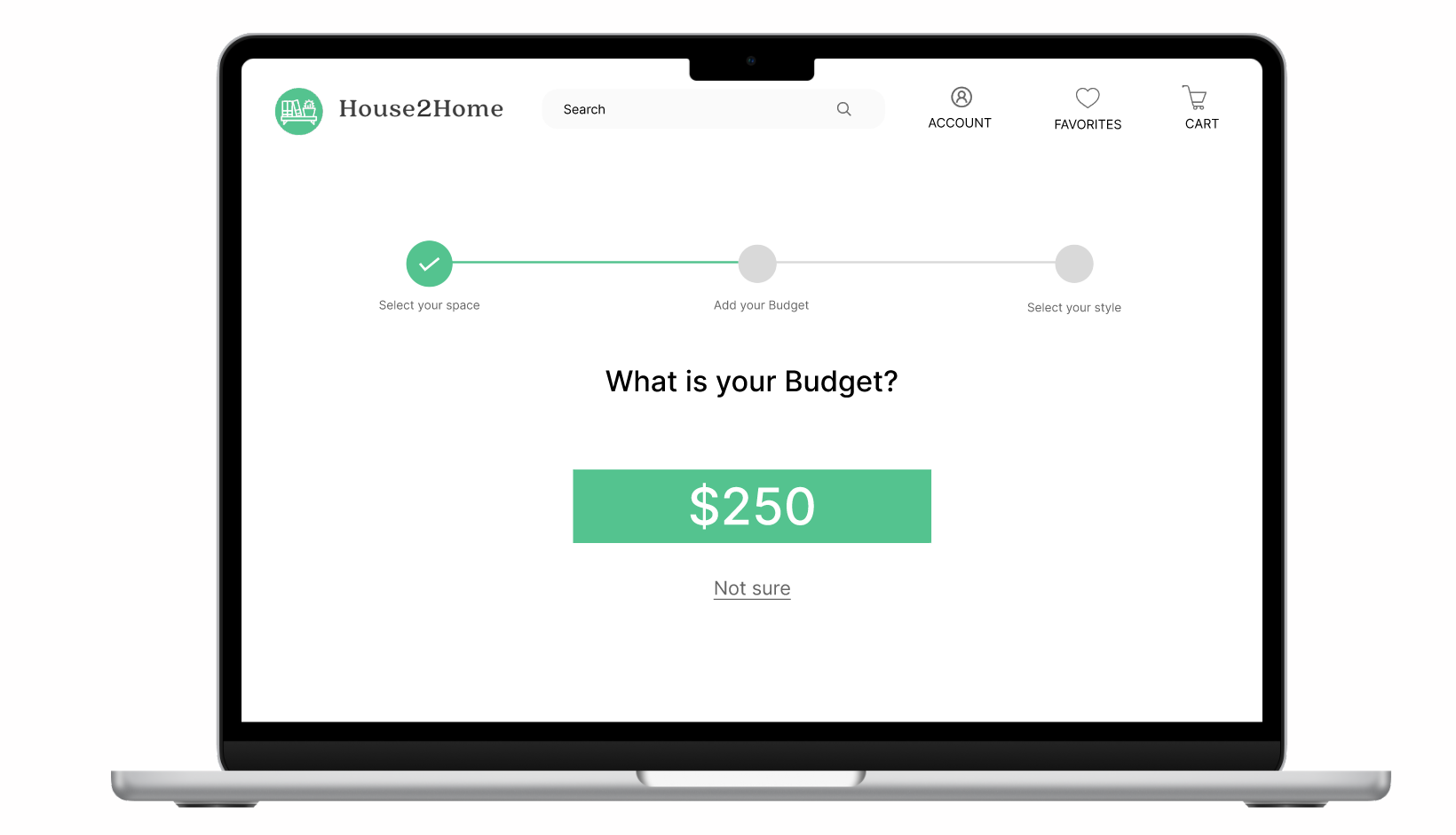
01 Budget UI clarity
4 out of 5 participants felt the Budget UI was not editable. They preferred to have dropdown or arrows beside the field to enhance understanding

03 Shorter Checkout Process
4 out of 5 participants wanted a shorter checkout process, citing too many pages in the current flow.

02 Style Description
3 out of 5 participants preferred having style descriptions below the images for quick identification, such as classy, minimalistic, midcentury modern, etc.
Reflect
In summary, the testing phase brought about highly positive outcomes. The majority of users encountered no significant issues with the user flow, and the identified areas for improvement primarily involve enhancements to further elevate the user experience. The users expressed a genuine appreciation for the app's visual appeal and aesthetics, conveying a sense of ease in discovering decor items aligned with their style and budget. Importantly, users did not feel overwhelmed during the selection process and while adding items to the cart, highlighting the overall success of the app in delivering a user-friendly experience.
If given more time, I would improve:
Clarity to the budget page by incorporating arrows or a confirm button, enhancing user understanding when editing the budget.
Include descriptions for various room styles
Streamline the checkout process by consolidating address, shipping information, and payment details into a single page.
Cleanup of the UI, implementing minor adjustments to elevate the overall user experience.
Implementing these changes is poised to significantly enhance the user experience. Overall, the GV design sprint proved to be a highly enjoyable experience. Through its execution, I swiftly identified a problem and devised solutions within a mere five days—an achievement that felt particularly gratifying as a solo designer. This experience underscored the remarkable utility of design sprints in streamlining and expediting the product development process. In the span of just one week, I successfully crafted a final product aligned with user needs, employing quick iterations and adjustments to address potential issues before committing substantial resources.
This design sprint was done as part of a UI/UX Springboard Career Track academic project. Thank you for reading and feel free to leave any feedback😊
View More Projects

BudgetBliss - Redefining Affordable Travel
Provides travelers access to budget-friendly deals and enables them to confidently make informed decisions, track their expenses, curate their itineraries, and enjoy memorable vacations within their financial constraints.