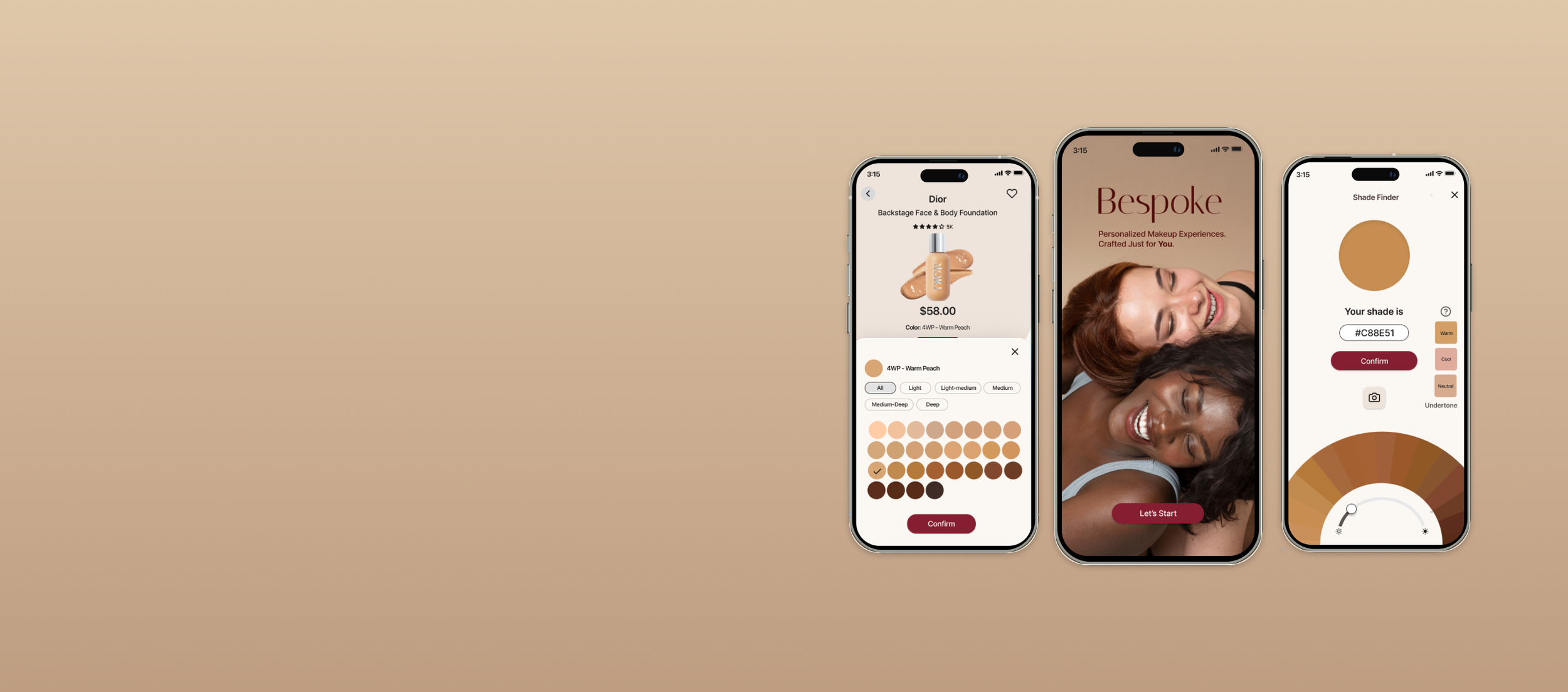
Bespoke
Personalized Makeup Experience
Design a solution to uncover the underlying challenges users encounter in choosing the right foundation online and identify measures to streamline the product selection process. Additionally, explore ways to design a guest checkout process to address cart abandonment and increase website revenue.
Timeline
4 weeks
My Role
Solo UI/UX Designer and Researcher
Tools
Figma, Figjam, Adobe Firefly, Canva
Process
Empathize, Define, Ideate, Prototype, Test and Iterate.
Overview
Bespoke, an e-commerce platform specializing in beauty products, aims to enhance its conversion rate and user experience. The primary focus is on transitioning users from browsing to checkout, ultimately boosting revenue and app usability. The product manager has identified two critical issues affecting customer experience and hindering potential sales:
User Decision Paralysis: Approximately 50% of users open an average of 7 item pages with different foundation products but abandon the site without adding any items to the cart. The company hypothesizes that users struggle to choose the right foundation based on its relative features.
No Guest Checkout: About 70% of users who place items in the cart do not complete the purchase. Data indicates that users abandon the cart at the registration page, where account creation is mandatory for purchase.
View Prototype

The Challenge
Uncover the underlying challenges users encounter in choosing the right foundation and identify measures to streamline the selection process and add to cart. Additionally, explore ways to design a guest checkout process to address cart abandonment and increase website revenue.
Solution
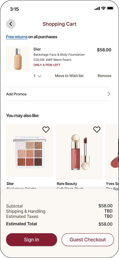
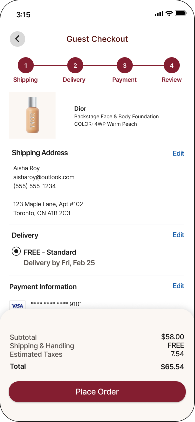
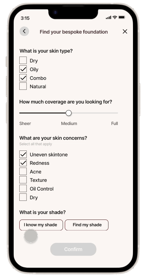
Design a interactive filter and shade finder solution for users to find their bespoke foundation, making product selection easier. Also, simplify checkout with Guest checkout by removing mandatory account creation.
Project Plan
Before jumping on to research, I started by creating a project plan outlining all the steps to needed to complete my work. This included the steps taken at each of the phases, the methods, deliverables and also time estimates to keep organized, maximize efficiency, and optimize time utilization.

01. Discover
Secondary Research
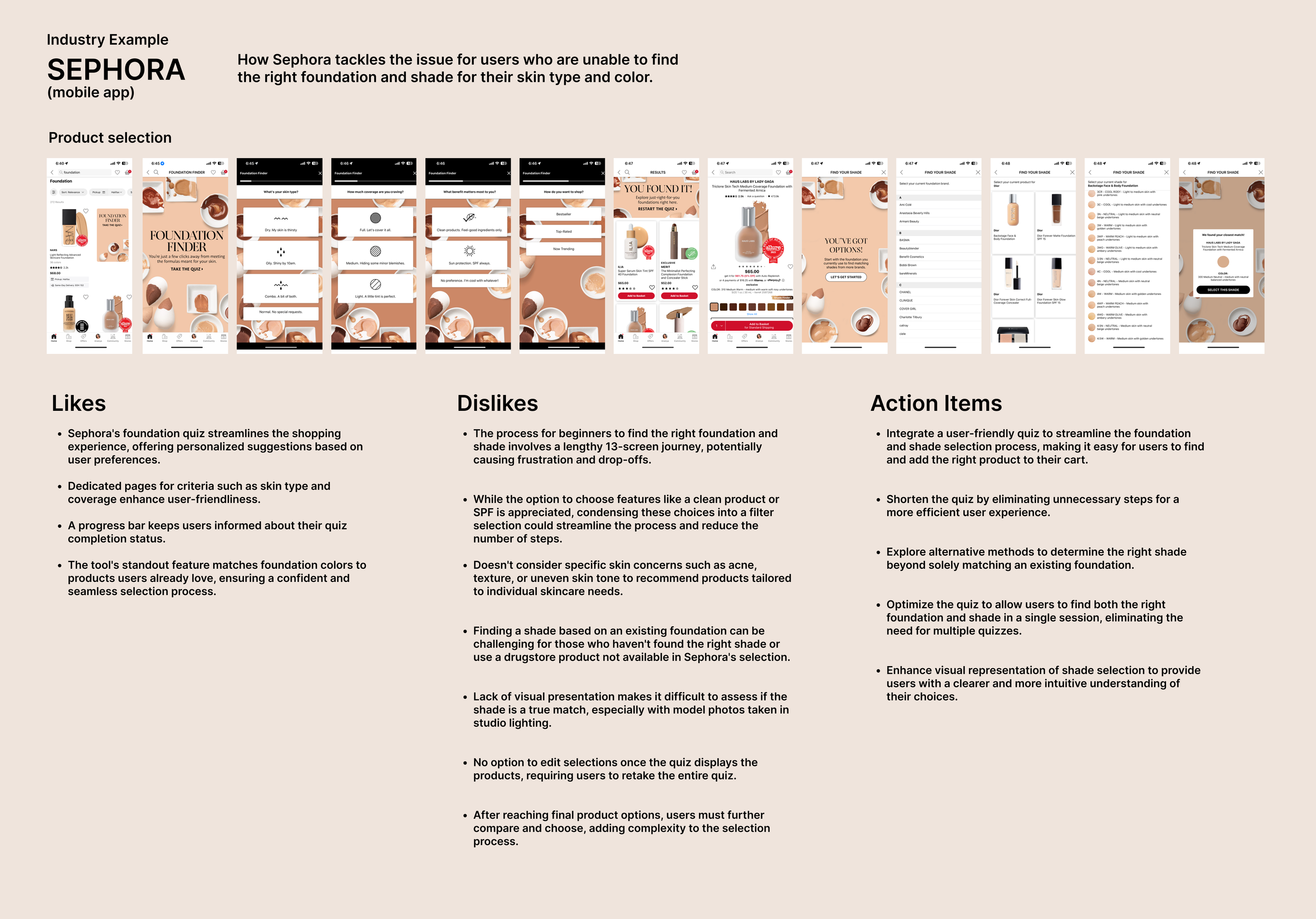
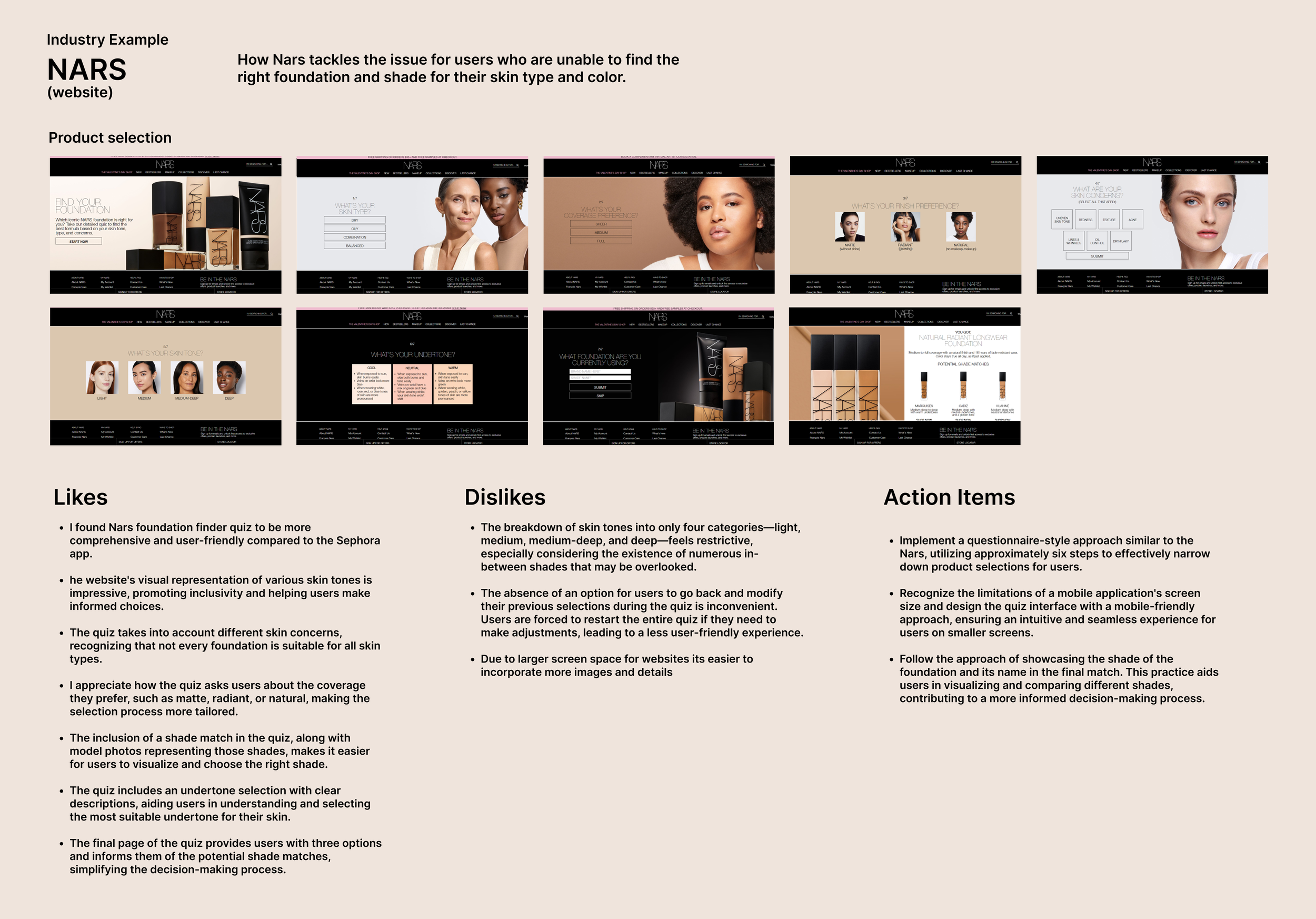
I started by researching popular e-commerce makeup websites like Sephora, Mac and Nars and how they tackle the issue for users who are unable to find the right foundation. From comparative analysis, I found that most websites offered quizzes or AI generated tools to identify the correct foundation and shade match, providing a personalized experience for users to find the right foundation and shade for them.
Additionally, I looked at how these websites have implemented their guest checkout process. From the comparative analysis, I was able to gain some key insights:
Sephora requires sign-in on its app but offers guest checkout on its website.
Nars and Mac lack mobile apps but provide guest checkout on their websites.
Guest checkout usually spans three steps: Shipping Address, Payment Information, and Review & Confirmation, promoting user retention.
Notably, websites prioritize account creation, with guest checkout option often being less visible.
Competitive analysis
-
![]()
Sephora
-
![]()
Nars
-
![]()
MAC

Primary Research
To get a better understanding of the problem space, I prepared a screener survey to screen out users who face difficulty in finding the right foundation to understand their pain points and determine effective solutions.
From the screener survey, I reached out to 5 ideal users for user interview who matched my criteria:
Aged between 20-40
Makeup enthusiasts
Regular users of apps/websites for purchasing makeup products
Face challenges in finding the right foundation online.
Shade accuracy is the most important factor when buying foundation online.

I then conducted a user interview to understand the challenges, frustrations, and experiences they had with foundation shopping online and how can the process be made easier to choose the right product for them.
User Interview questions
Can you remember when was the last time you purchased makeup products online?
Have you ever bought a foundation online? How was your experience?
When looking for a foundation what factors are most important to you?
How do you decide which brand of foundation to buy?
Have you ever used any foundation match tool?
What are the challenges you face when trying to find the right foundation online?
From the user interview, I was able to find some common challenges and needs among users to identify why users are unable to find the right foundation product.
Common Challenges
Users face issue with shade matching and undertone identification online with varying experiences and frustration with typical quizzes.
Users’ express concerns about the accuracy of online representations, including try-on features and studio-edited photos of models and inaccurate color representations.
Users widely acknowledge that finding the right foundation online is a trial-and-error process without the ability to do in-person swatches or color match.
Bad return policies also play a huge role in overall satisfaction with users.
Common Needs:
Users express the need for more accurate color representations, including realistic swatches on diverse skin tones, or arm swatches.
Users suggest categorizing shades by undertone for clarity during product selection.
There is a need for easier ways for individuals to identify their undertones before purchasing.
Users prefer purchasing from retailers where return policies are hassle free.
Users widely rely on reviews especially those with pictures, and appreciate recommendations from friends, family, and social media influencers who are close to their skin tone.
User Persona
Upon gaining a deep understanding of the target user, I created a User Persona. Crafting this persona enabled me to empathize with their unique goals and challenges in selecting the perfect foundation through online platforms.

02. Design
How might we questions
Based on my persona’s needs and challenges, I came up with these How might we questions to tackle:
How can I help my persona find the right foundation and shade online?
How can I make it easier for my persona to find the right undertone?
How can I incorporate reliable reviews to make her purchase decision easier?
How can I create a shopping experience that is easy and hassle free?
Wireframes
I started by pinpointing essential functionalities crucial for my user persona.


User Flow
I created a User flow to map out the journey the user would take from product selection to checkout. These user flows served as a precise, step-by-step visualization of the user's interactions with the interface. Subsequently, these flows became the foundational roadmap for crafting highly effective wireframes.
With the user flow, I was able to create skeletal structure of the mobile interface. My main goal was to simplify the selection process for choosing foundation and making it easier for users to find their right shade. I wanted to design a clean interface with logical structure and information architecture that was easy to follow and understand.

03. Round 1 Test
Low Fidelity Usability Testing
My main goal was to uncover the underlying challenges users encounter in choosing the right foundation and identify measures to streamline the selection process and add to cart. Additionally, explore ways to design a guest checkout process to address cart abandonment and increase website revenue.
5 participants were recruited at random from online communities and slack channel to conduct a moderated low fidelity usability testing.
Imagine you are someone looking for a new foundation online.
Tasks:
You are unsure what foundation to select, how would you navigate the app to find the right foundation for you?
Scenario 1:
You are unsure what your shade is, how will you find out?Scenario 2:
You know what your shade is, how will you find out?
How will you purchase your foundation?
Can you walk through the steps you will take to Guest Checkout?
What was your overall experience, satisfaction/dissatisfaction with the app?
Were there any issues you encountered while navigating through the app from product selection to guest checkout?
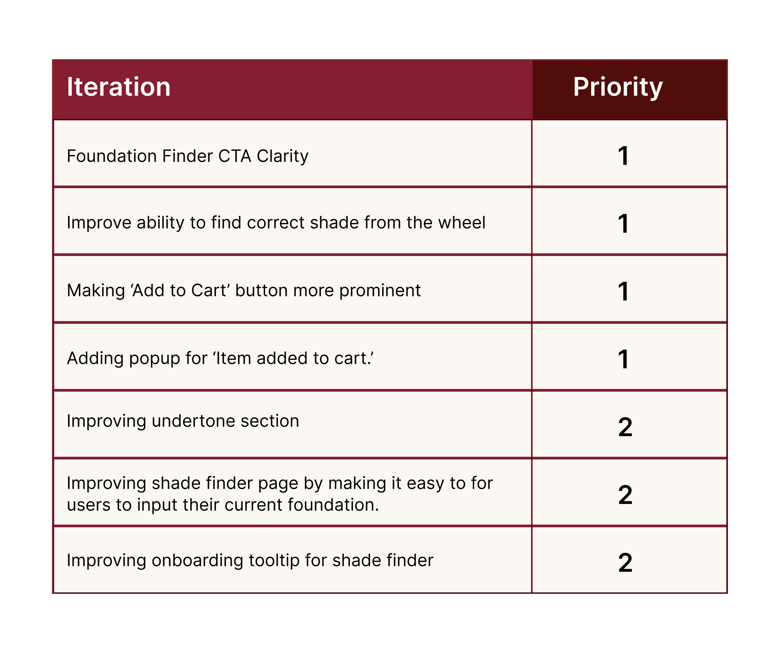
Key Findings

Round 1 Testing

01.
Foundation Finder Clarity:
While most users were able to find the foundation finder, but 3/5 users presumed locating the right foundation in the face category and not on the home page. Additionally, a few users mentioned due to the text being so close to the logo, it looked more like an ad.

02.
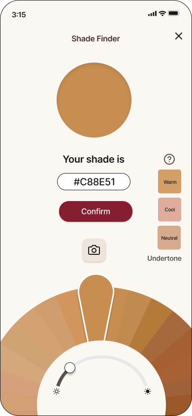
A/B Testing Foundation Shade Finder options:
I wanted to test two ways users were able to find their shade. Test A being the option to find their shade based on a foundation they already have and Test B for users who didn’t have a perfect match and wanted to find their shade from app’s shade wheel.

Test A
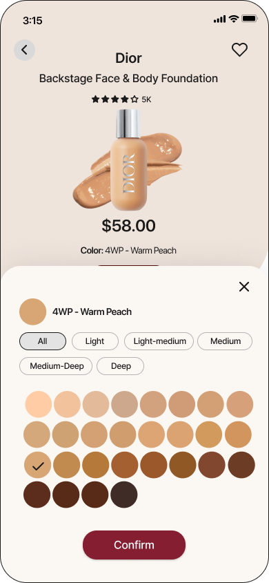
From testing, I found that most users were familiar with Test A but wanted the ability to input brand names or find foundation from search if they couldn’t remember the name and shade.

Test B
Most users found Test B very interactive and mentioned they would test it out if they didn’t know their shade. But there were some usability and clarity issues that could be improved on, such as:
Improving the onboarding tooltip to make it stand out more.
Improving undertone selection by adding more information on different undertones.
3/5 users felt they weren’t properly able to identity their shade by just looking at the wheel and having a camera feature to upload their photo would be nice to identify their closest shade.
03.
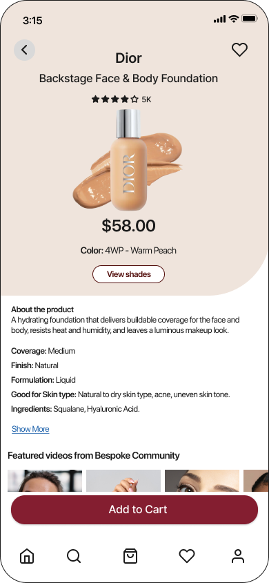
Product Page clarity & Add to Cart Confirmation
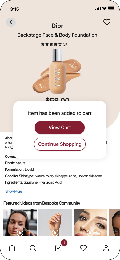
Although most users were able to properly identify the ‘Add to Cart’ button but voiced the option to make the button more prominent for easy identifying.
5/5 users wanted to see the popup for ‘Item added to cart.’

From the results gathered through testing, and my user persona in mind, I decided to prioritize the iterations that would improve usability of my app.

04. Design & Iterate
Style Guide
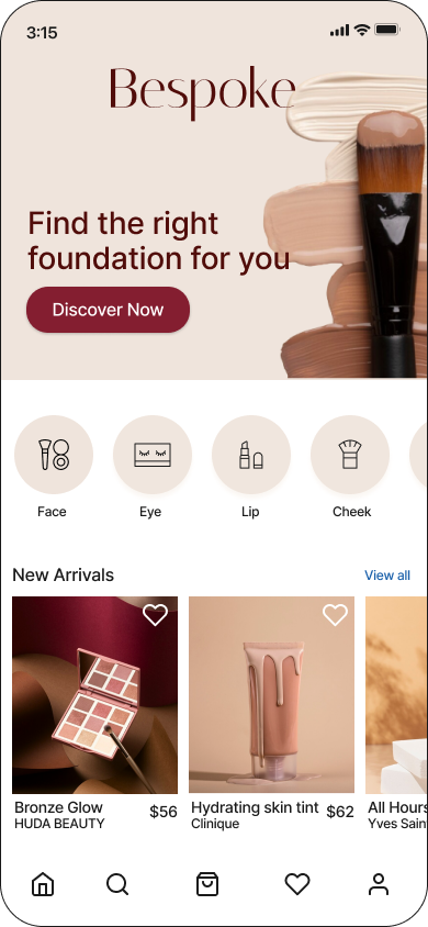
Prior to designing high-fidelity mockups, I established a style guide for my app. This involved crafting a distinct brand identity for Bespoke, encompassing the creation of a logo, typography style, color palette, photography and defining the brand personality. My vision was to showcase diversity and inclusivity within the app. "Bespoke" epitomizes customization and tailoring to individual specifications, precisely reflecting the personalized experience I aimed to deliver to users.


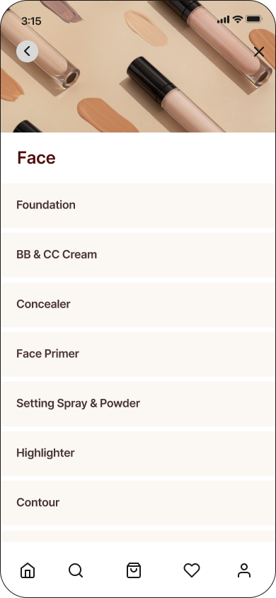
High fidelity designs & prototype


05. Round 2 Test
High Fidelity Usability Test

For the 2nd round of testing my goal was to validate the iterations made based on the findings in Round 1 testing to see if the issues were addressed and resolved.
For this, I recruited 5 potential users from social media and slack channels to conduct remote moderated testing.
In the round 2 testing, users encountered no issues in locating their desired foundation shades and completing guest checkout. However there was still some room for improvements in UI that could refine the app.
Before
After

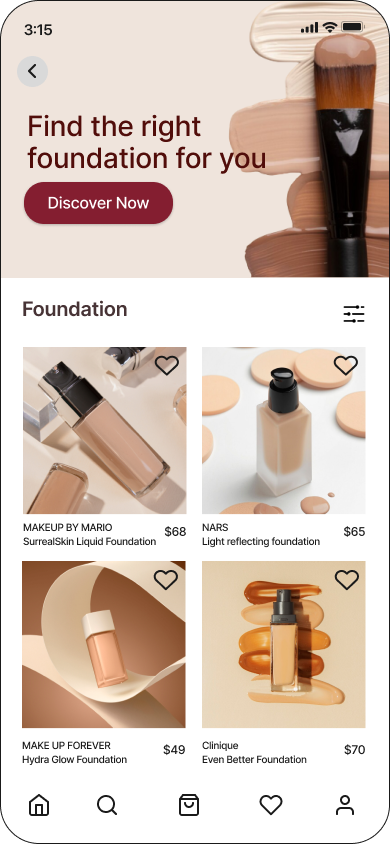
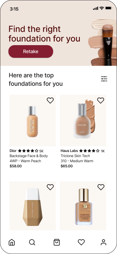
Improved Foundation Finder Discoverability
To improve discoverability of Foundation Finder, I added a CTA button ‘Discover Now’ and added another flow where users would also be able to access it in Foundation page under Face category.
5/5 users were easily able to identify and discover the Foundation Finder in round 2 testing.
A/B Testing Shade Solutions

In the previous testing, I found that users would prefer to have the option to input their foundation manually or search the brand name as most couldn’t remember the exact name. To tackle this, I added the ability to search the foundation.

Most users highly valued the interactive shade wheel and recognized it’s value for the instance they didn’t have a perfect shade to match with.
One user mentioned they would use it for adjusting shades during summer months when they are more tan. Users also liked the option to have more control of their shade.
Adding the photo upload feature also proved highly valuable for users to identify their shade from the color wheel.
4/5 users were able to identify their shade.
Some minor UI issues came from 2nd round of testing, like improving the animation and clearer instructions in onboarding.
Prominent CTA button and confirmation


In Round 1 Testing, most users were able to identify the ‘Add to Cart’ button but felt the CTA was too small. Furthermore, once they have added the item to Cart, they preferred to have a pop up window for confirmation.
In Round 2 Testing, these challenges were resolved with the larger CTA button and ‘Add to cart’ confirmation.
06.Iterate and Reflect
Returning to my perona’s goals and challenges, I designed a solution aimed at assisting her precisely matching her shade and undertone, which was one of the biggest factors for her in choosing the right foundation.
The interactive filter, and shade finder lets her find the bespoke foundation tailored to her skin type and tone streamlining her selection process and facilitating seamless guest checkout.
Reflection
In embarking on this project, I chose to tackle the challenge of online foundation shopping, recognizing it as a universal struggle faced by individuals of all genders.
Driven by my own struggles and the desire to make a difference, I created an app that would revolutionize the way we shop for foundations online. As I delved deeper into the project, I faced challenges at every turn - how could I ensure that users found their perfect shade match? How could I prevent them from feeling overwhelmed and abandoning their cart?
I reached out to countless users with different skin tone and shades and listened to their stories and it became clear for me to create an app that was inclusive and promoted diversity.
Key takeaways
While the solution effectively addresses the primary challenges associated with finding the right foundation, it's crucial to acknowledge additional factors that influence the user experience, such as color accuracy in real life versus on the app. As technology and AI continue to advance, the gap between color representation on our devices and real-life shades and tones is expected to narrow significantly.
Given more time, I would like to test my final design further and expand on the Bespoke community feature. The community feature would help users in finding the right foundation through the real time swatches and reviews, while also help them connect with individuals with similar shades. I would also like to enhance interactivity of the shade wheel to make foundation shopping fun online.
Thank you so much for reading my case study, feel free to leave any feedback below.
View More Projects

BudgetBliss - Redefining Affordable Travel
Provides travelers access to budget-friendly deals and enables them to confidently make informed decisions, track their expenses, curate their itineraries, and enjoy memorable vacations within their financial constraints.

House2Home E-commerce Website for New Homeowners
House2Home is a home decor e-commerce website, helping new apartment or home owners to confidently curate a diverse array of home décor items and accessories to decorate their spaces according to their unique style and budget.